•••
Archive
An additional group of campaigns I've art directed and have always been happy to share. Some of this work was made at smaller agencies and I consider the limited budgets and resources a point of pride. I fought back at limitations with multiple fonts (Avia/ESPN) and custom illustration styles (Brooks/Woodland Park Zoo) of my own creation. Also, I drew a pterodactyl fighting an orca for a commercial and no one stopped me. Who wouldn't be chuffed with that?
Agency: Fallon, Minneapolis
Copywriters: Caroline Stamy & Joanne Torres
Art Directors: Jacqui Bontke & Myself
Chief Creative Officer: Leslie Shaffer
Production Company: Epoch Films
Direction: Matt Swanson
Editorial: Brian Gannon
MATTRESS FIRM
When you have the right mattress, nothing gets in the way of a good night’s sleep. Not a bad back or snoring partner or even a guilty conscience. Earlier this year, my freelance partner and I joined the team at Fallon in the effort to show how Mattress Firm can help anyone sleep at night. Even if that person deserves to have their car keyed. The following is a selection of our work that made it to air.
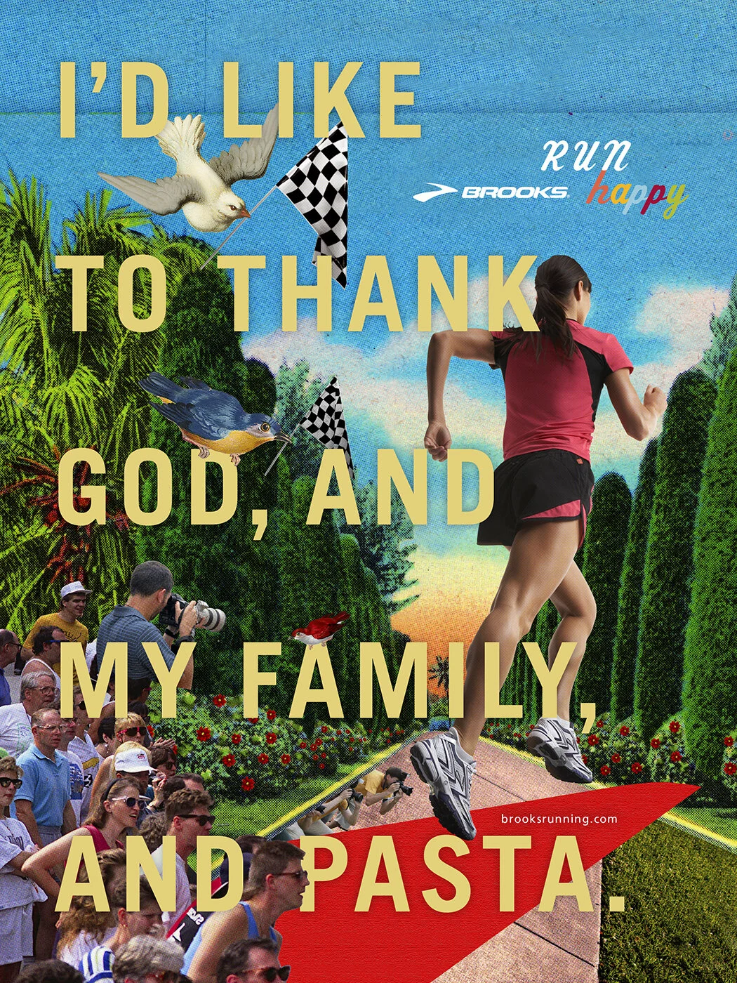
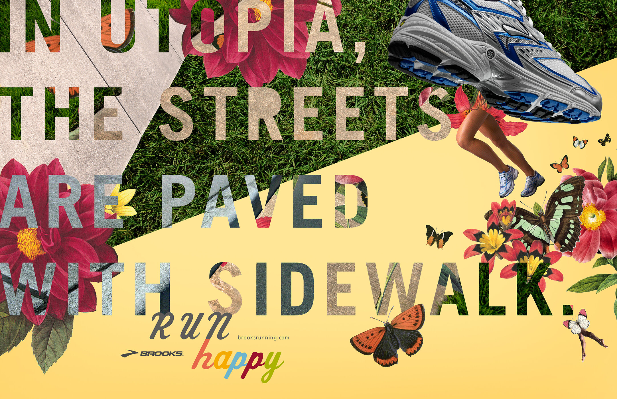
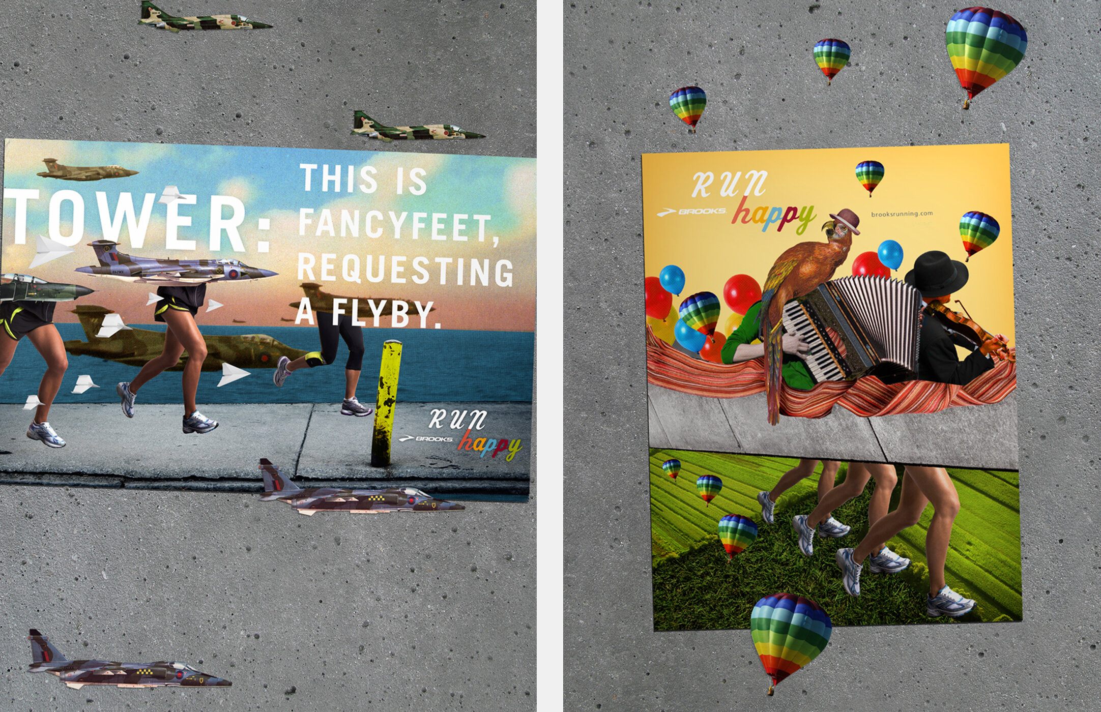
BROOKS RUNNING
Brooks running shoes were often perceived as exclusive to hardcore runners. This was partly due to their limited availability through specialty retailers. In an attempt to draw in casual fitness runners, Brooks began to widen its distribution to mass-market sporting goods stores. The 'Run Happy' campaign was created to push the pure joy of running to a wider audience.
Agency: La Comunidad, Miami
Copywriter: Jake Wheeler
Creative Direction: Joaquin Molla & Rodrigo Butori
Direction: Piccadilly Curtains
Production/Animation/Editorial: Strange Beast
Sound Design: Cam Ballantyne // Beatworms
Music: Jon Hopkins
Illustrator: Barry Bruner
Photographer: Jeff Minton
SAUZA 901
In my time at La Comunidad, I was the senior art director on a marathon creative effort to introduce the world to a partnership in the spirits category between Sauza and Justin Timberlake’s 901.
Our creative challenge was to combine the history of Casa Sauza, a storied tequila brand, with the personality of arguably the world's most iconic pop star. So, we had JT himself introduce a new player on tequila’s top shelf with a series of videos and social media posts telling the Sauza 901 story.
Below is a sampling of the initial creative work, including the visual style that I developed over months of social posting.
Agency: WONGDOODY, Los Angeles
Copywriter: Joe Beutel
Creative Direction: Sean Vij & Court Crandall
Animation & Editorial: WOODSHOP
Sound Design: Robot Repair
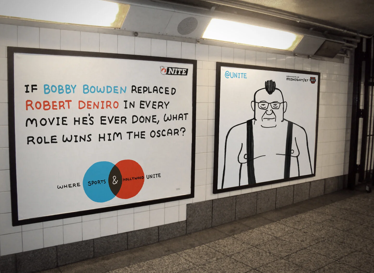
ESPN UNITE
With UNITE, ESPN was looking to find a late-night college-aged audience. We did this by billing the show as the place "Where Sports and Stuff Unite." What kind of stuff? Stupid stuff, weird stuff, cats riding turtles stuff. You know the guys who switch over to Adult Swim after the late Sportscenter is over? The kind of stuff those guys care about. Then we branded the show with a hand-drawn campaign that posed absurd hypotheticals to get the conversation started.
WOODLAND PARK ZOO
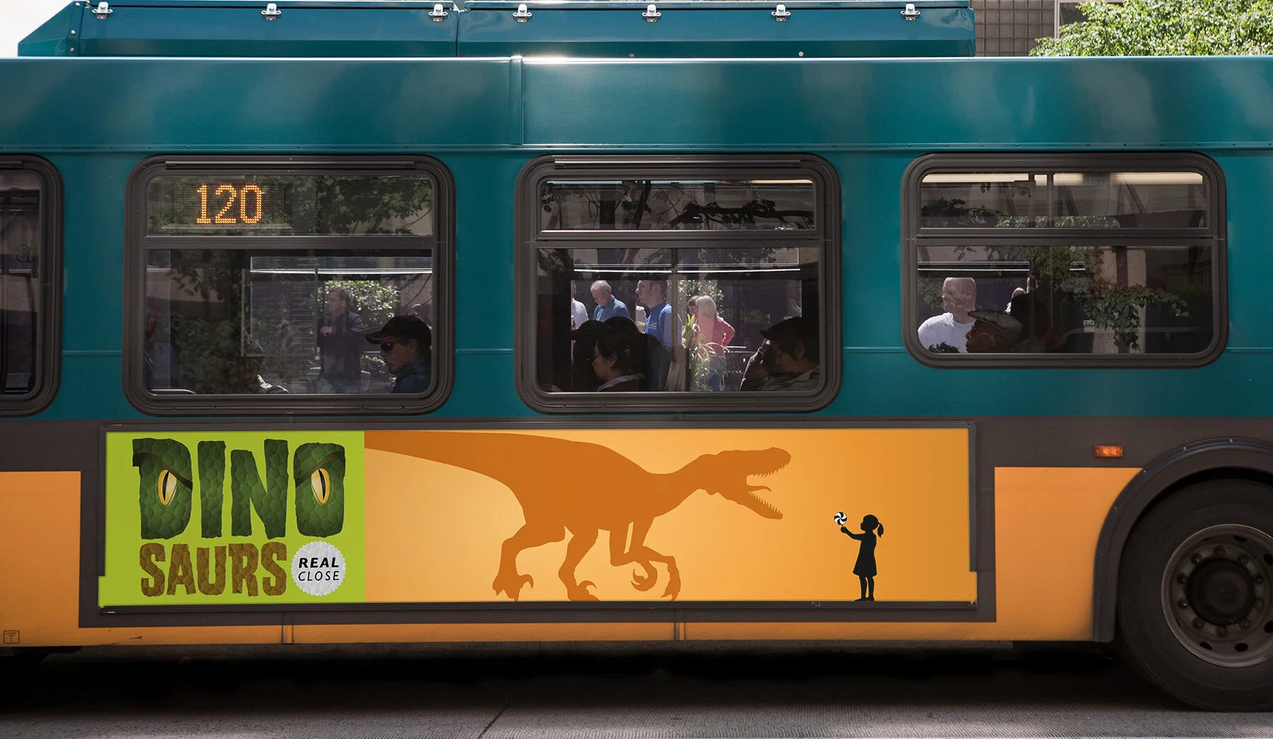
I’ve seen my share of confounding briefs but found the headline, "DINOSAURS AT WOODLAND PARK ZOO", especially troubling. It turns out the dinosaurs were animatronic and tour zoos nationally as a special exhibition to increase summer patronage. The resulting work took over Seattle for a summer, won enough ADDYs that someone had to grab a moving box to get them back to the office, and I saw an email about some pencil-shaped something or other.
Agency: WONGDOODY, Seattle
Copywriter: Matt McCain
Creative Direction: Mark Watson
Animation & Editorial: World Famous
Sound Design: Clatter & Din
AVIA
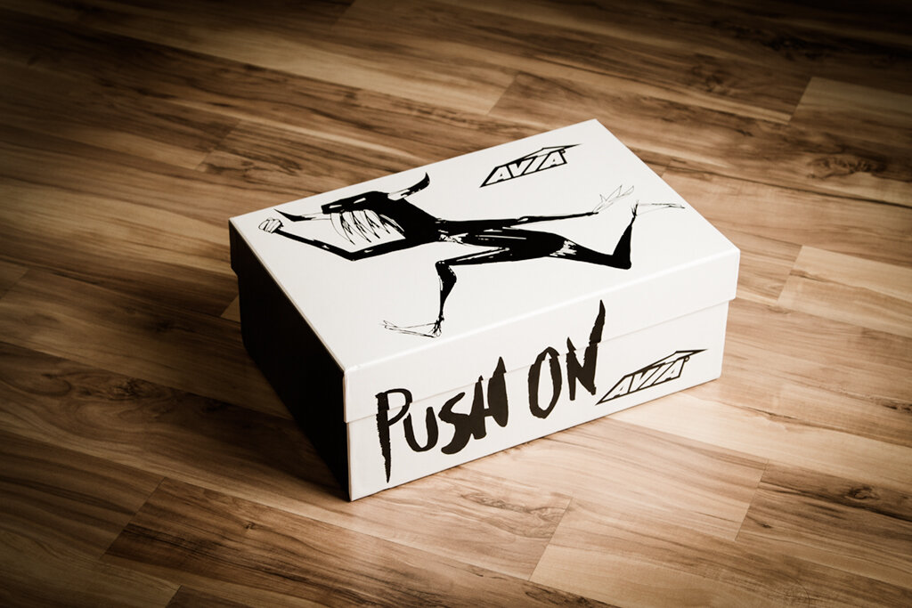
Our mission was to take AVIA away from being a family shoe brand and give it the teeth to speak to the mindset of the crossfit audience. They needed something uniquely ownable that distanced them from the high-polished, generic athletic shoe market, where NB, Saucony, K-Swiss and others all look the same. The work needed to feel raw, stark and brutally honest.
The illustration solution was both conceptual and practical. Conceptual in its distinction from the glossy running shots that everyone else in the category were using, and practical in that we could do it in-house on the cheap.
The athletes we were talking to take a masochistic approach to their training. They give everything they have, every workout. We wanted to champion that idea, and let them know that AVIA understands how they think, and how they train. That’s why we embraced black-and-white, both as a color palette and a philosophy. Either you’re training or you’re not. There’s no gray area. The imagery we chose were hyperbolized metaphors for all the challenges athletes face, external as well as internal. Paid off with a simple, honest truth. Push on.
The result was AVIA signing contracts with over 500 crossfit gyms across the country, and striking a chord with crossfit athletes everywhere.


