•••
Archive
An extended selection of projects that I put the design hat on for. Which is not a literal hat, but if it was it I promise it would be well-designed and have an accompanying brand standards book that would read as complete and thoughtful.
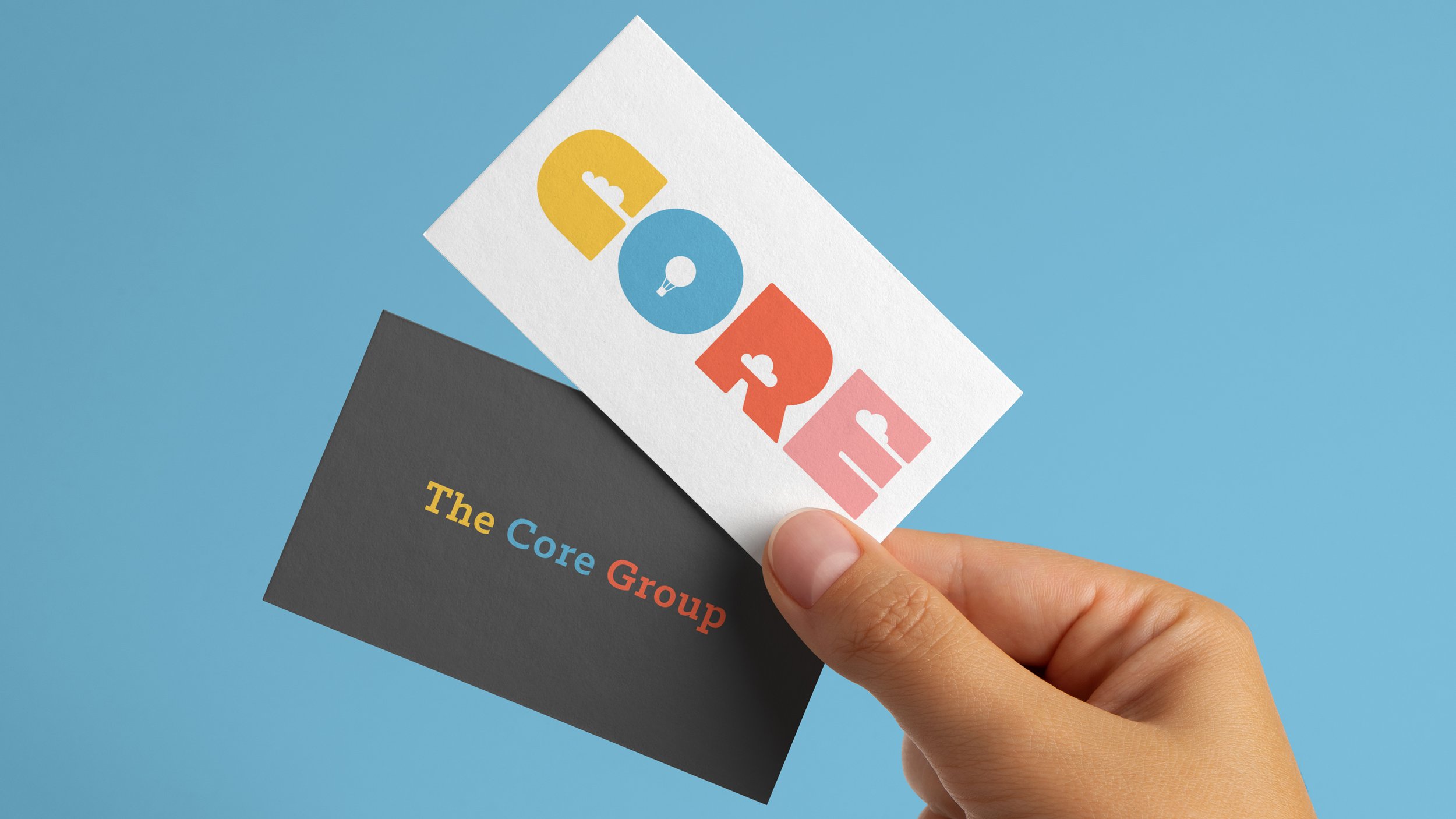
THE CORE GROUP
The Core Group is an innovative, Bay Area start-up focused on creating immersive educational programs. The organization's joyous spirit of academic exploration serves as the conceptual basis for the logomark and the supplemental branding elements you find featured here.
RAISED REAL
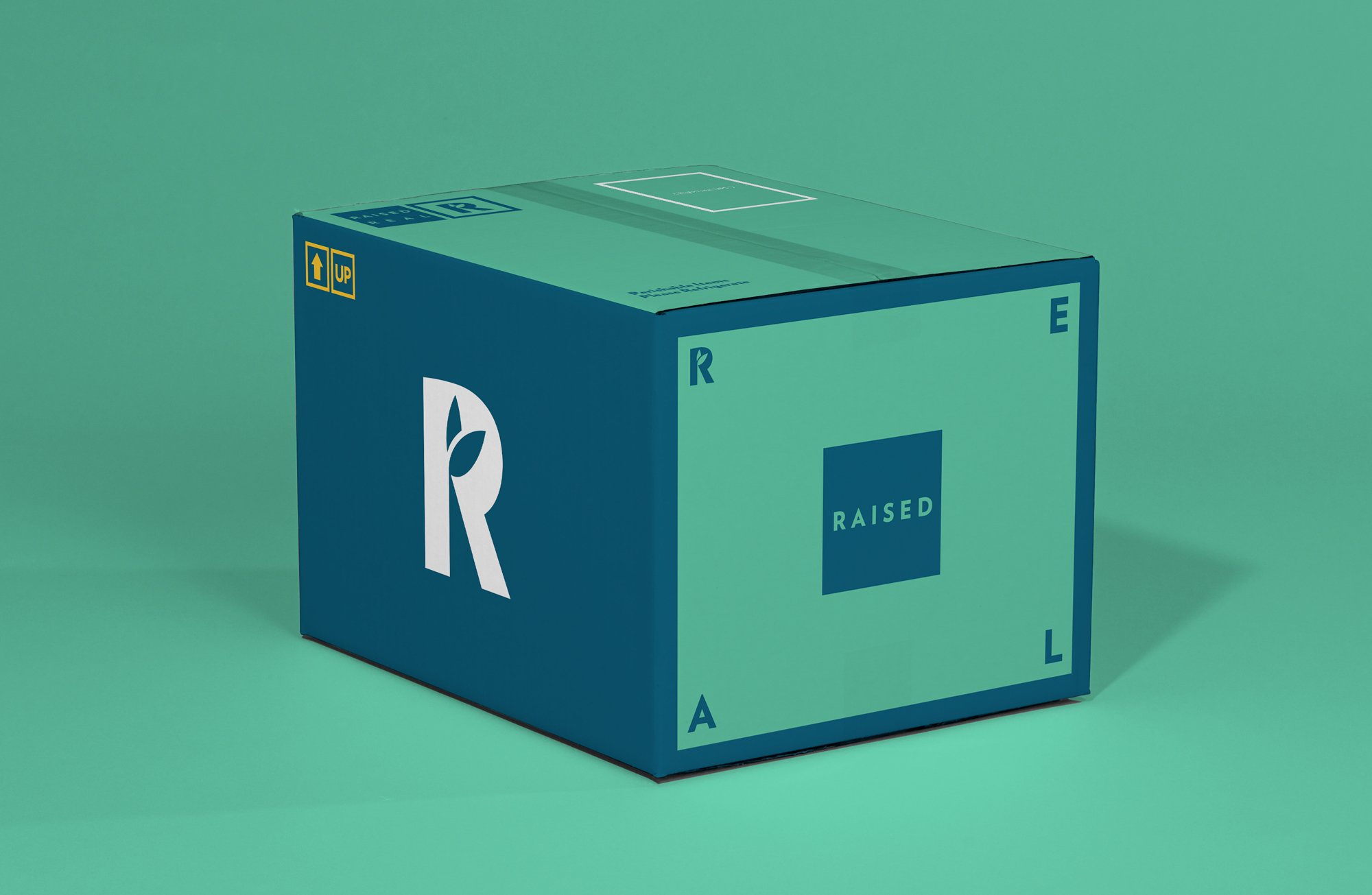
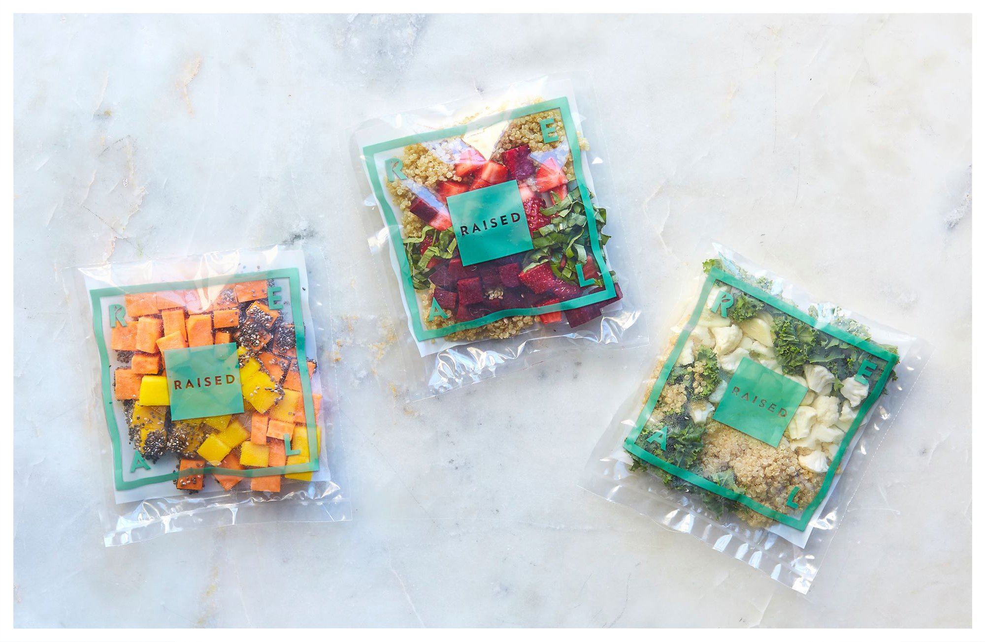
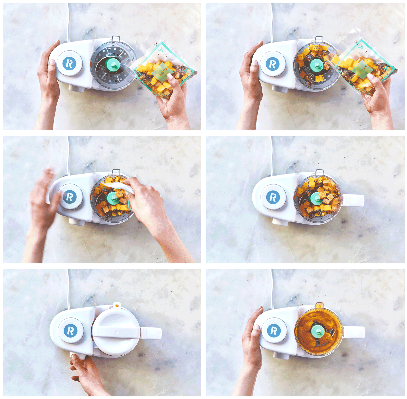
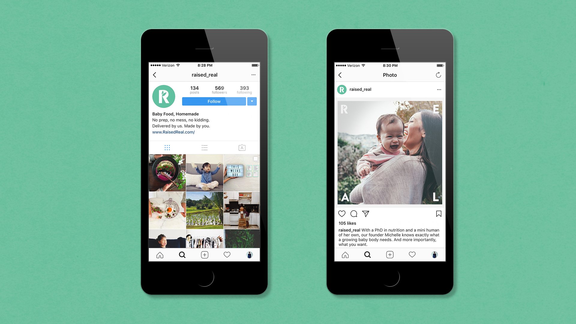
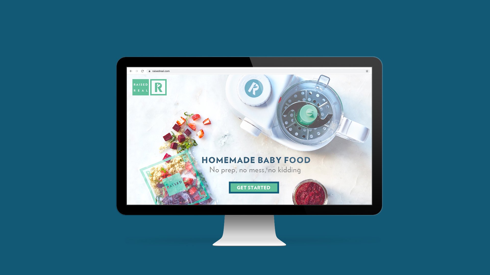
Two Bay Area entrepreneurs came to Mono with an idea that revolved around a simple belief: feeding your babies the best possible food shouldn't be a luxury. It should be easy, and it should be made with real, unprocessed ingredients. The founders had the sourcing and distribution plan in place, but nothing else. So we got to work and built the brand from the ground up; providing the strategic platform, name, logo, package design, and tone of voice. The result: Raised Real – a weekly box subscription service that delivers farm-fresh baby food ingredients to the doors of busy parents. All they have to do is steam, blend and serve.
The name rose to the top because, to us, "real" captured the spirit of the brand. Real food, flash frozen at the peak of freshness, and with complete transparency of how the food is grown and sourced. But it also touched on a belief in parents staying true to themselves and ignoring societal pressures to be perfect parents. Instead, just keep it real.
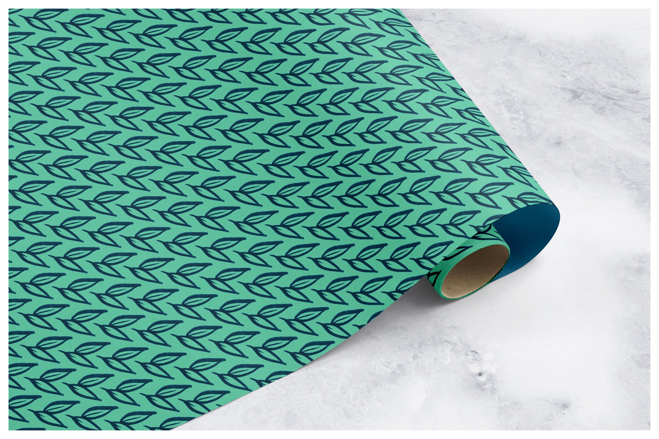
With the name in place, the logo and brand book followed. The goal was to create a clean and thoughtful design system elevated for adults. Breaking from the childlike color schemes and corny farm imagery of the baby food category. With simple guidelines for easy implementation once we handed it off to the Raised Real team back in San Francisco.
As a result, the branding was a critical component to partnerships and funding that accelerated the founders' launch and expansion plans.
Agency: Freelance, Minneapolis
Creative Direction: Mike O'Malley
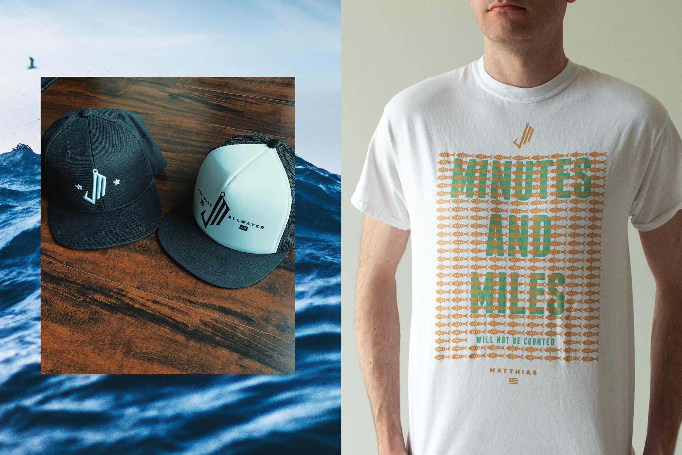
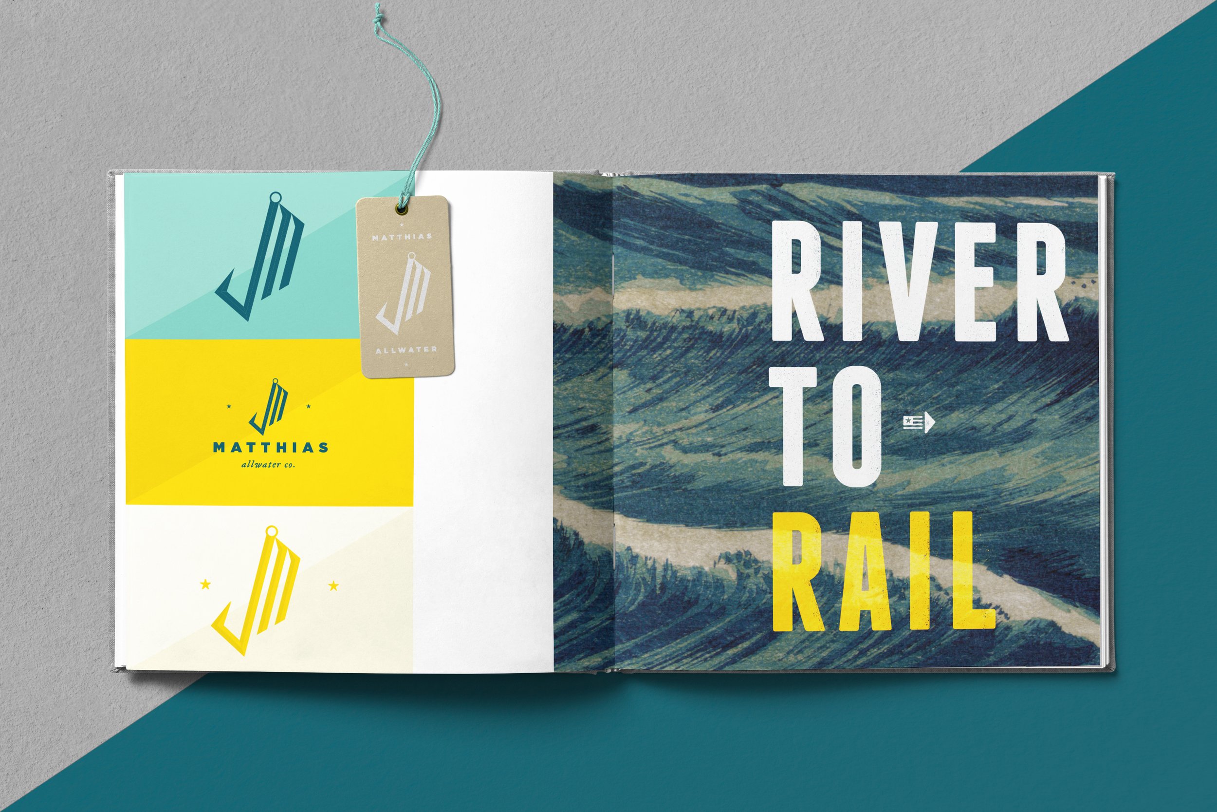
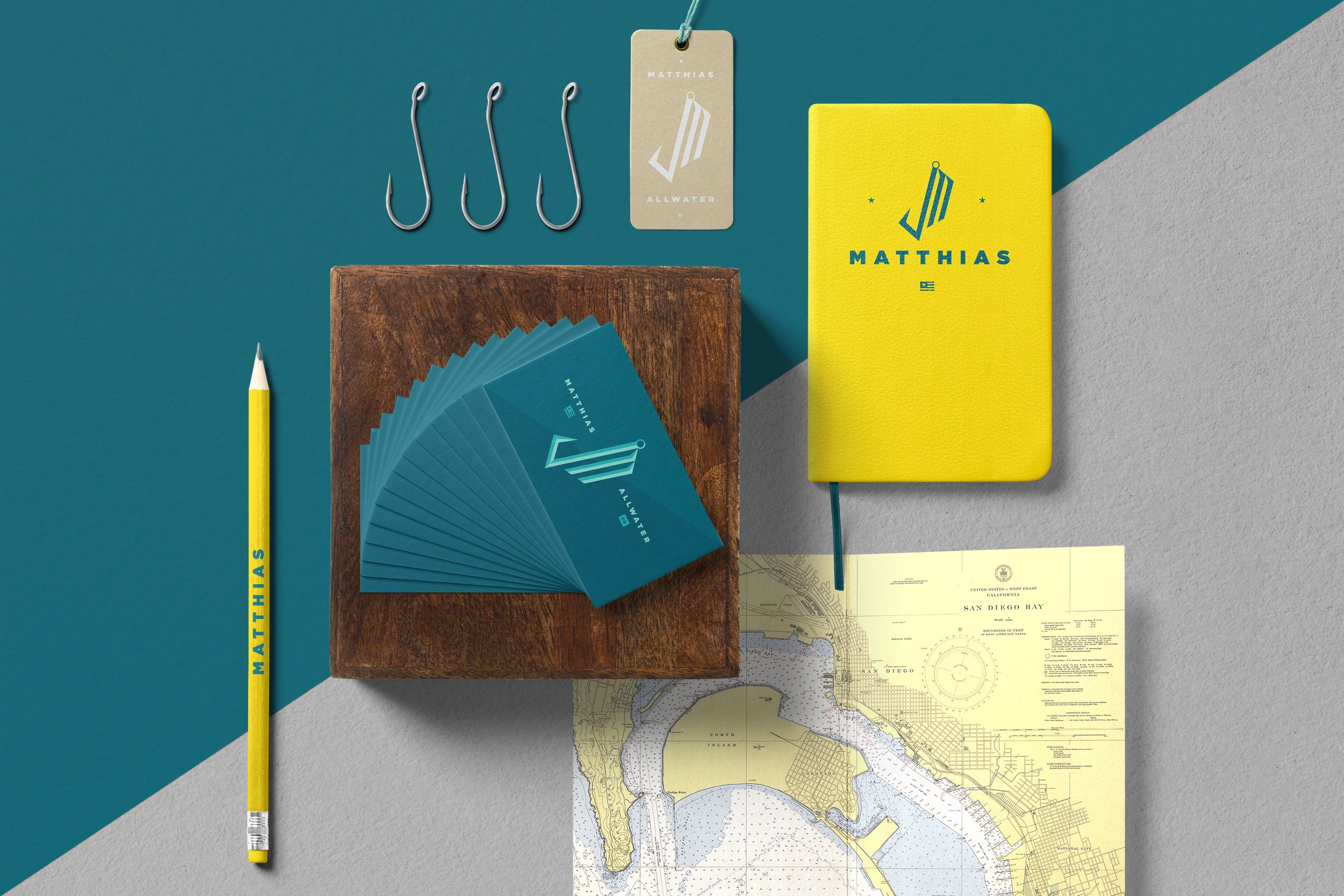
MATTHIAS ALLWATER
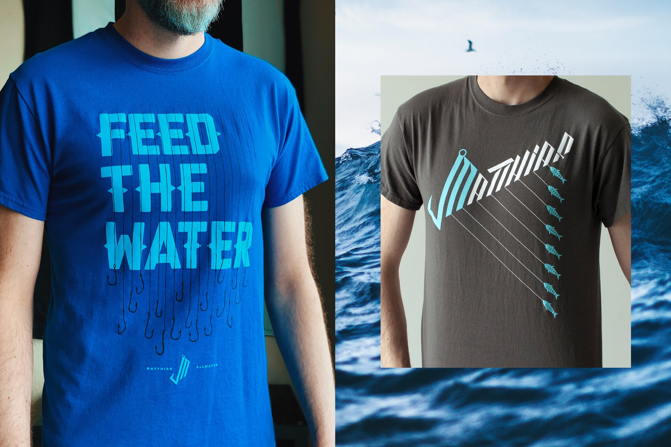
A friend and former coworker of mine is a pretty obsessed fisherman. In 2015, he came to me with a business idea based on an insight he noticed about young people on long tours: they fish in surfing apparel. It's a sport with a wide audience that wants more than camouflage, but is currently only being offered clothing from traditional outdoor (read: Dad) retailers.
And with that, Matthias Allwater was born. A passion project that intends to give the fishing community a badge to proudly wear on the river, at the rail, and everywhere in between.
Below is a taste of what launched in limited fishing retailers on the west coast. Including the logomark, select apparel, brand book and application.
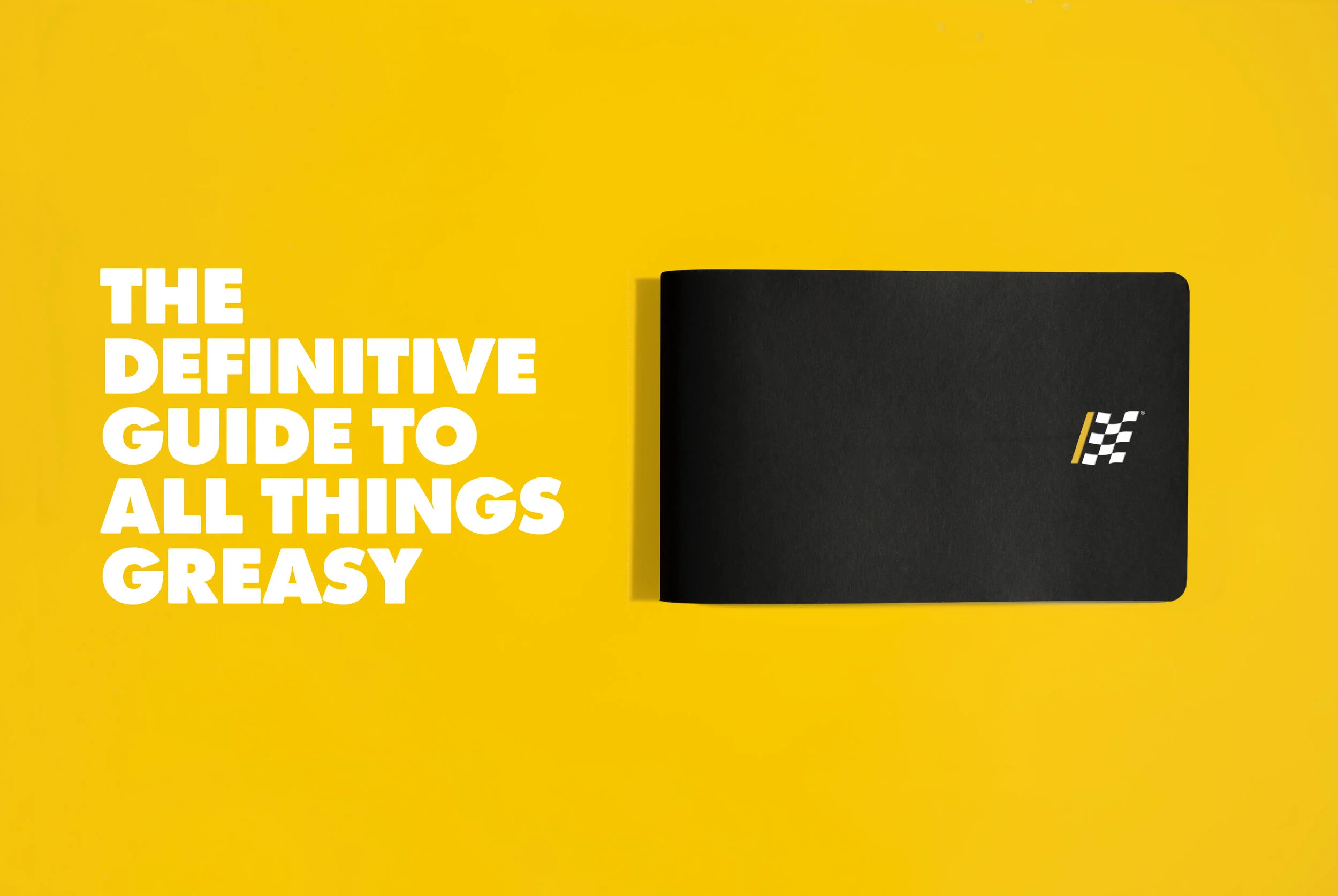
ADVANCE AUTO PARTS BRAND BOOK
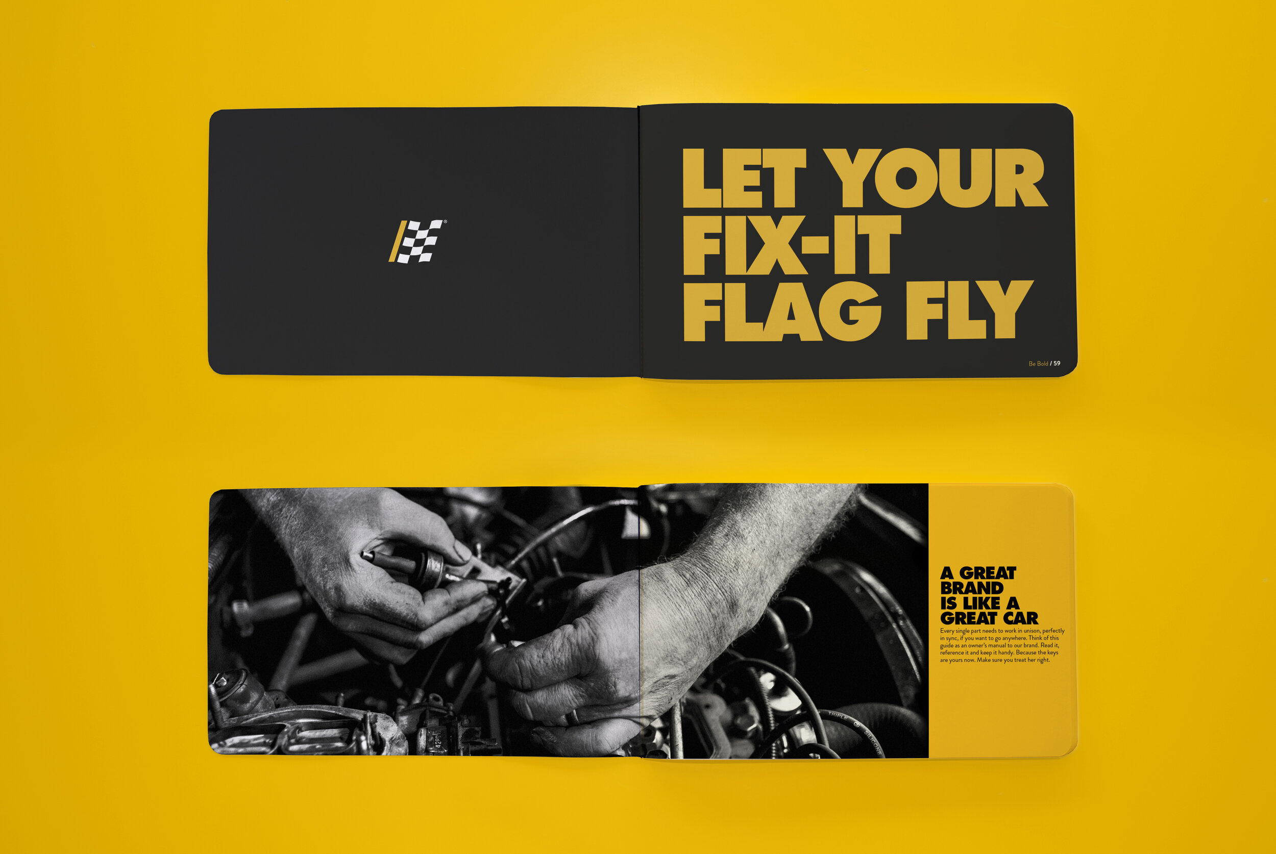
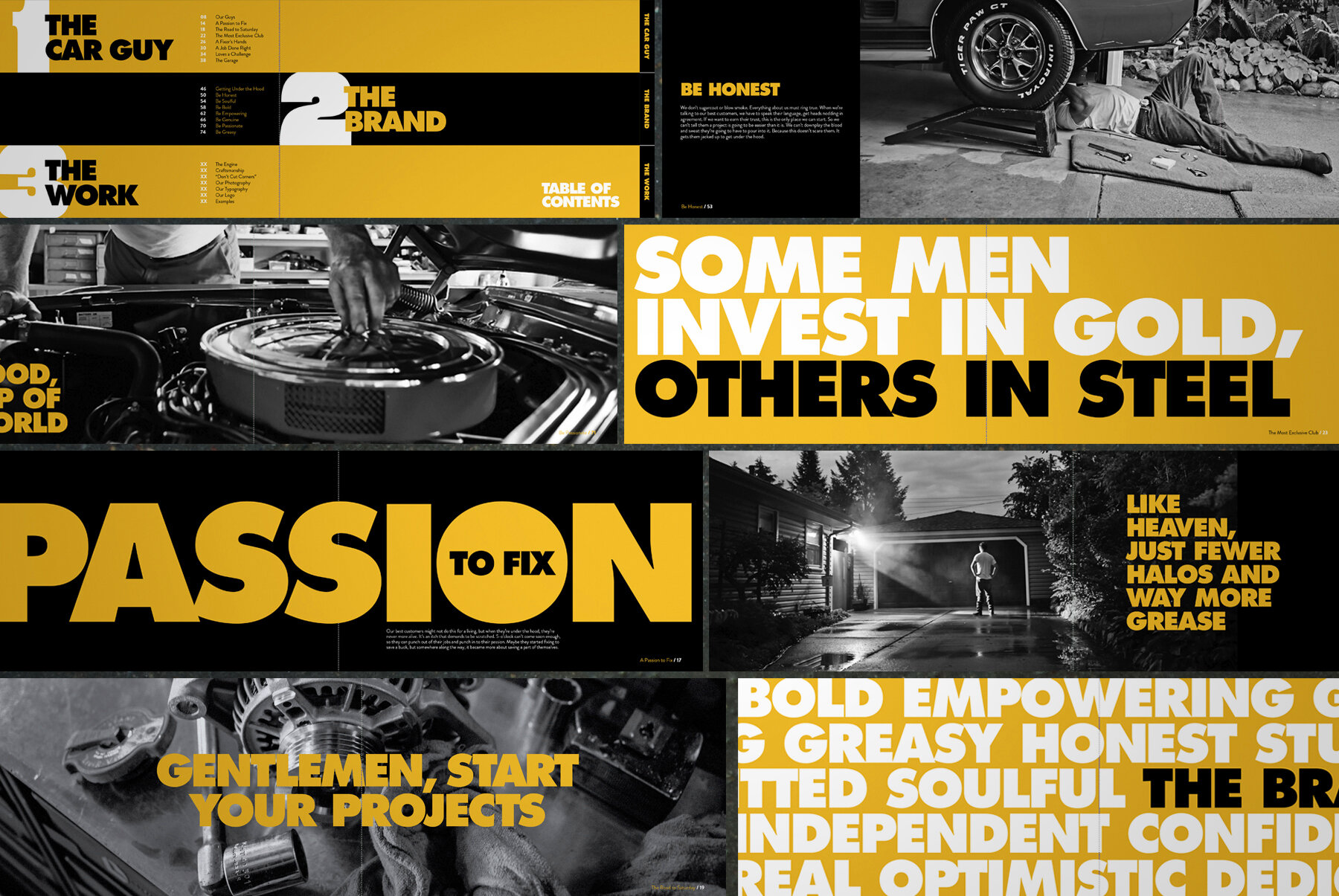
In 2014, mono partnered with retailer Advance Auto Parts to reintroduce its brand to the heavy DIYer. After creating a grittier, more soulful brand voice that welcomed men back to the garage, it was the agencies' task to help AAP's internal marketing and design teams become ambassadors. My partner and I were tasked with creating a glove box-sized user manual on how to talk to guys who would rather be getting their hands dirty than listening to an advertisement.
BIG TEN NETWORK
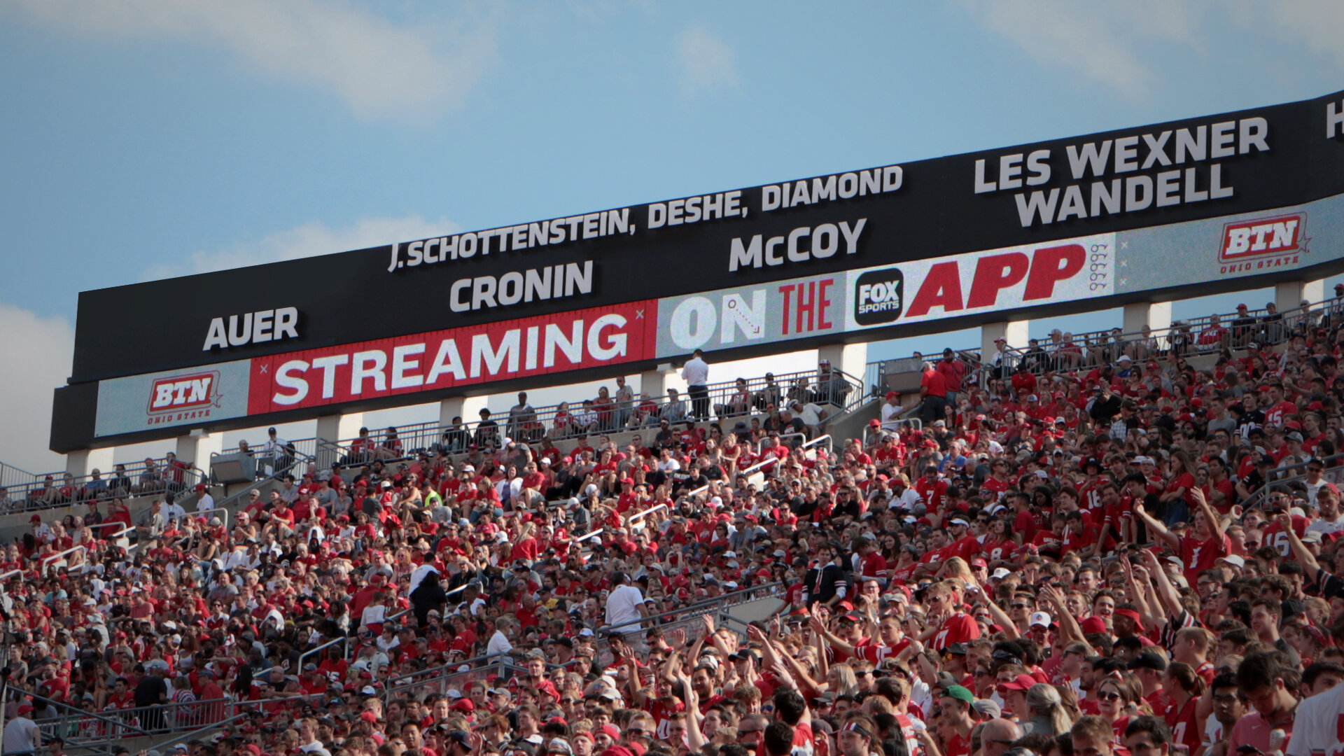
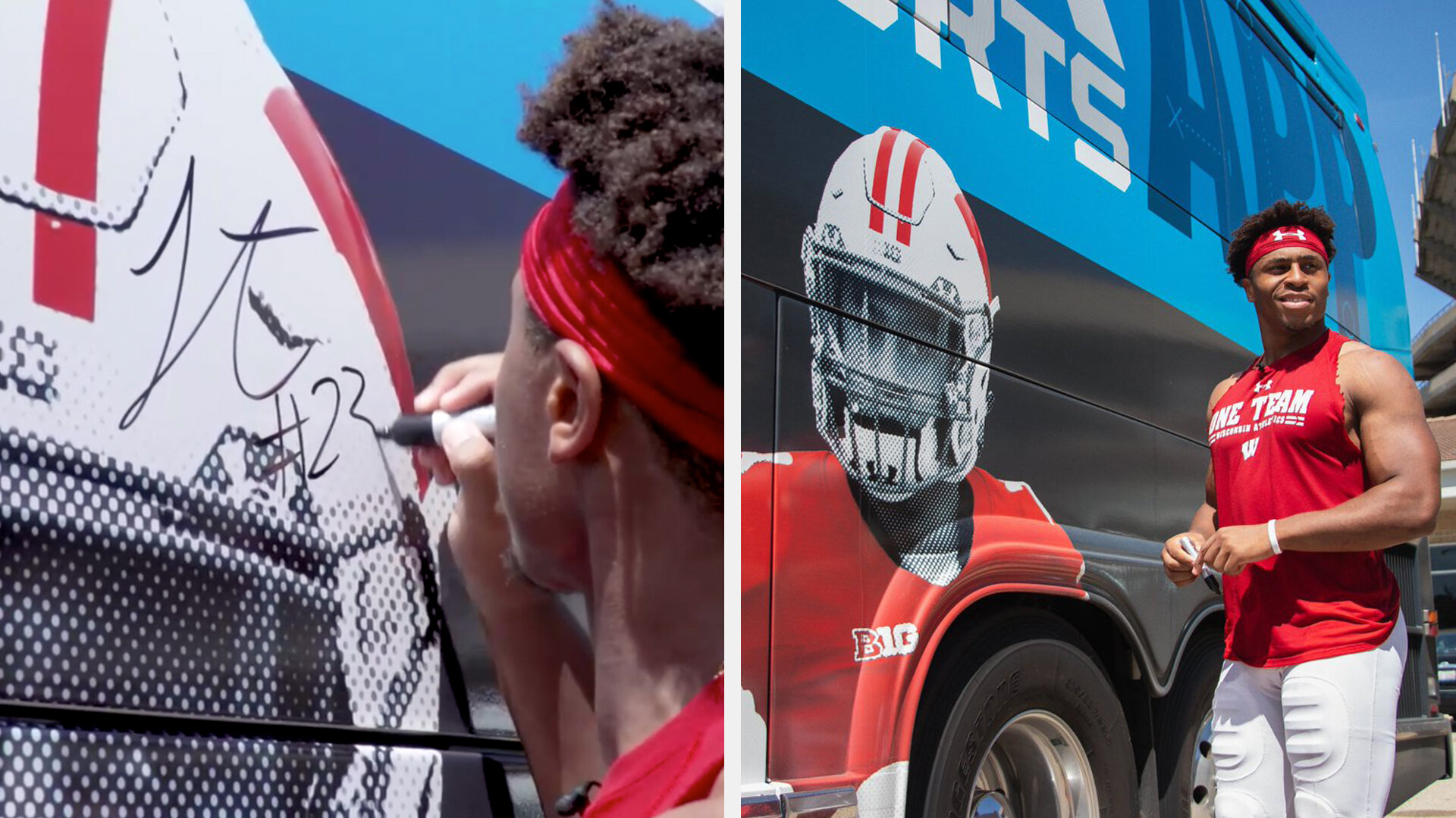
In the fall of 2019, the ability to stream the Big Ten Network moved to the Fox Sports App. The network created a campaign of television, social media, and in-stadium materials to make sure Big Ten fans knew where their favorite games were being broadcast during the football season. Building a visual language that was flexible enough to include the colors and logos of 14 universities as well as Big Ten Network and Fox Sports branding was a tricky task. We walked that tightrope by keeping the messaging simple.
Agency: WONGDOODY, Seattle
Copywriter: Aimee Willis
Creative Direction: Mark Watson
Direction & Editorial: Oh, Hello
Sound Design: Clatter & Din
SEATTLE INTERNATIONAL FILM FESTIVAL
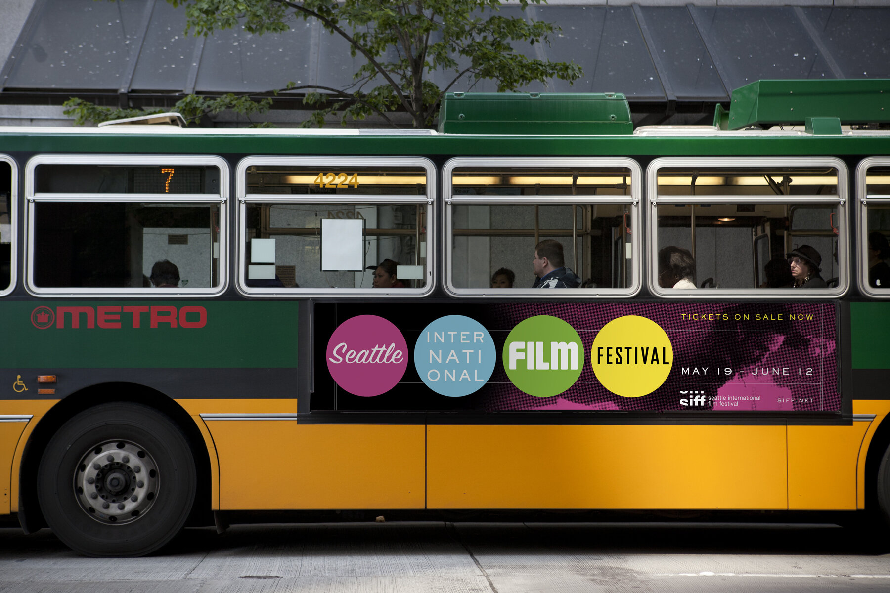
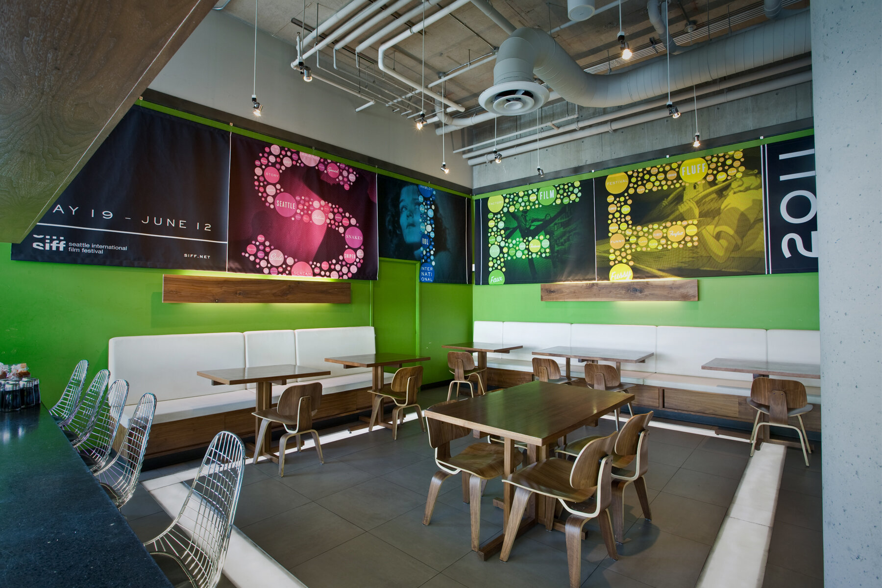
To Northwest film buffs SIFF stands for Seattle International Film Festival, a 24-day blitz of over 400 films, now in it’s 38th year.For their 2011 campaign, we used films that had their premiere at SIFF to celebrate everything that the acronym has stood for. Everything from “Somewhat Intense Family Feud” (The Empire Strikes Back, 1980) to “Stomach Incubates Furious Foreigner” (Alien, 1979 World premiere).The campaign consisted of a festival trailer and animated bumpers (numbered in the menu) As well as logo treatments, outdoor, posters, and pretty much every type of collateral material you could think of.
Agency: Freelance, MInneapolis & Seattle
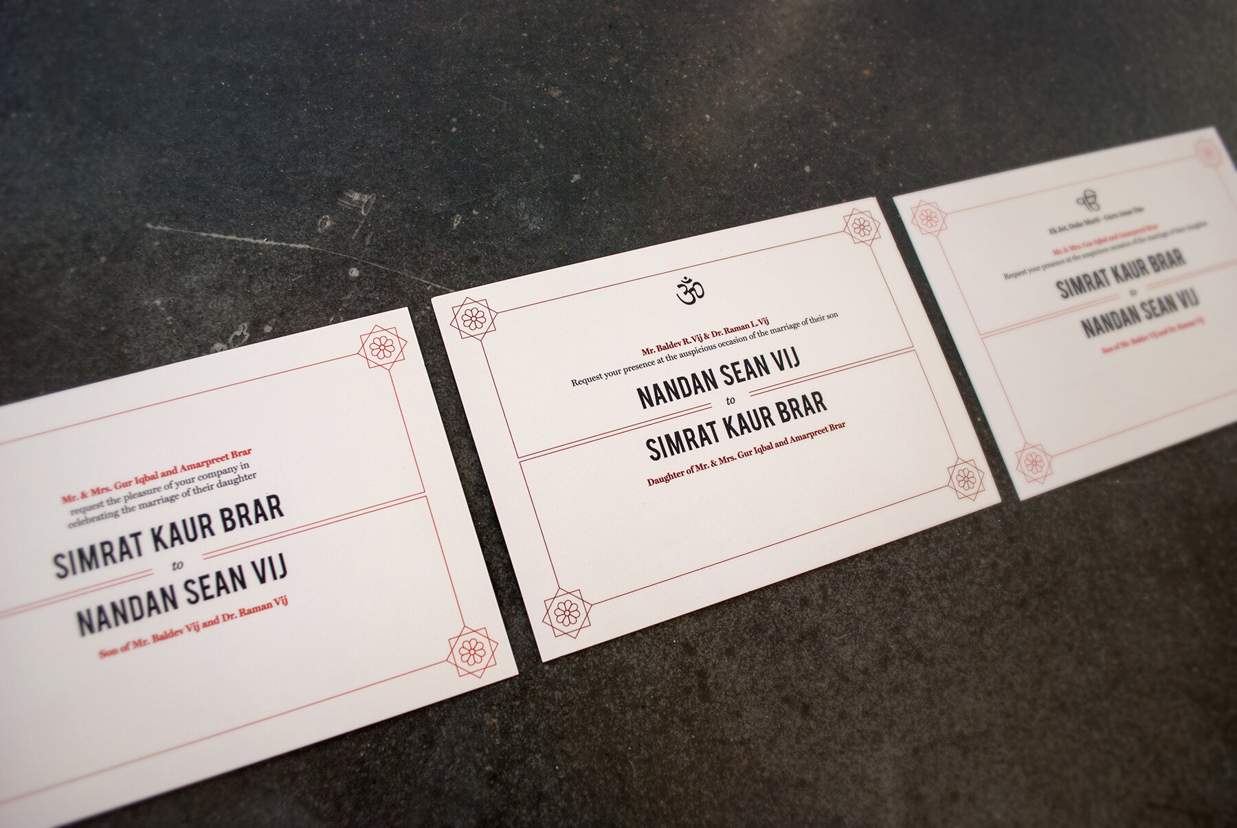
Client: Heidi Leliefeld Brown & Anthony Brown / Sim Brar & Sean Vij
LOVE & PRINT
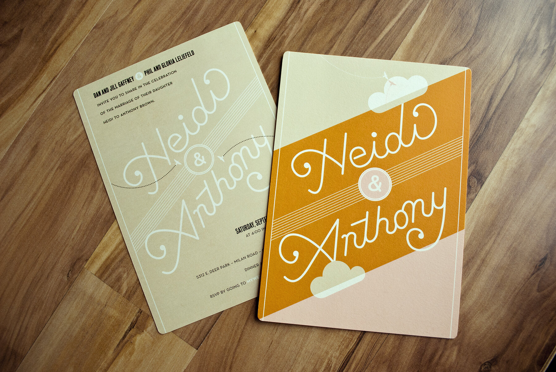
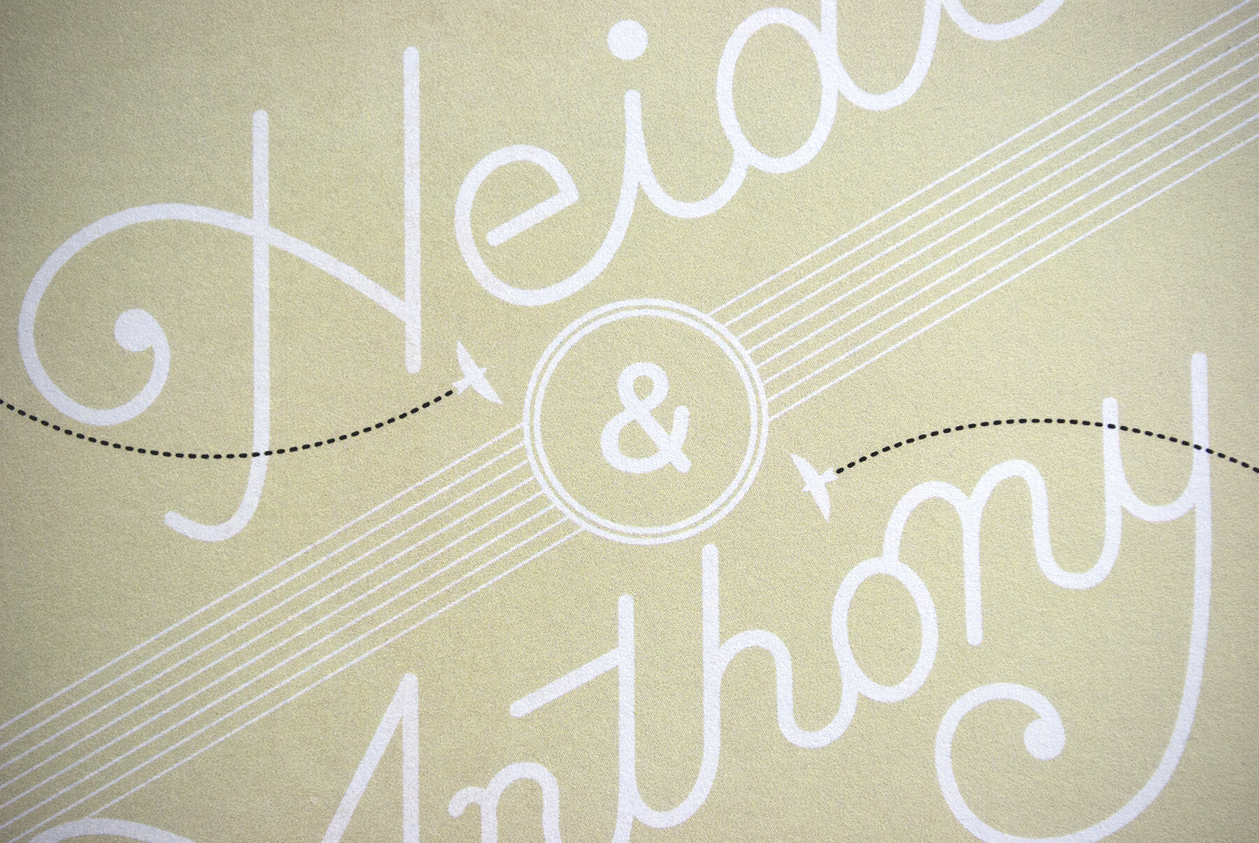
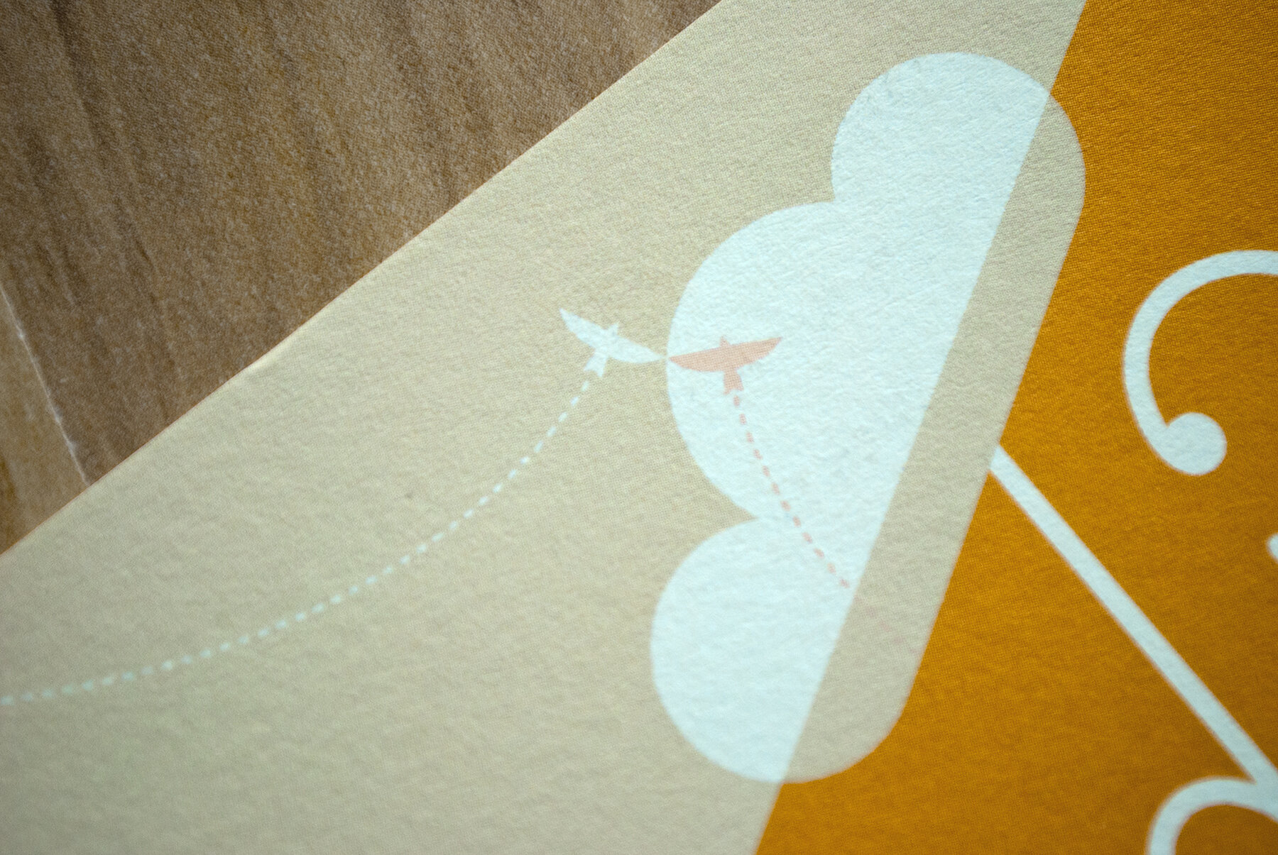
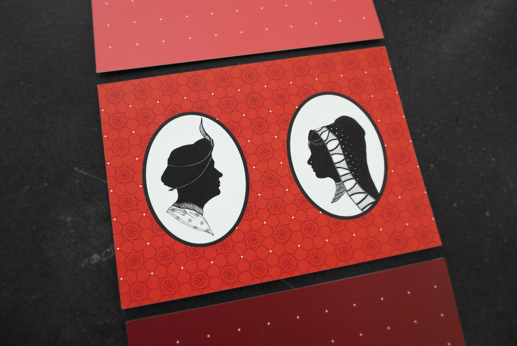
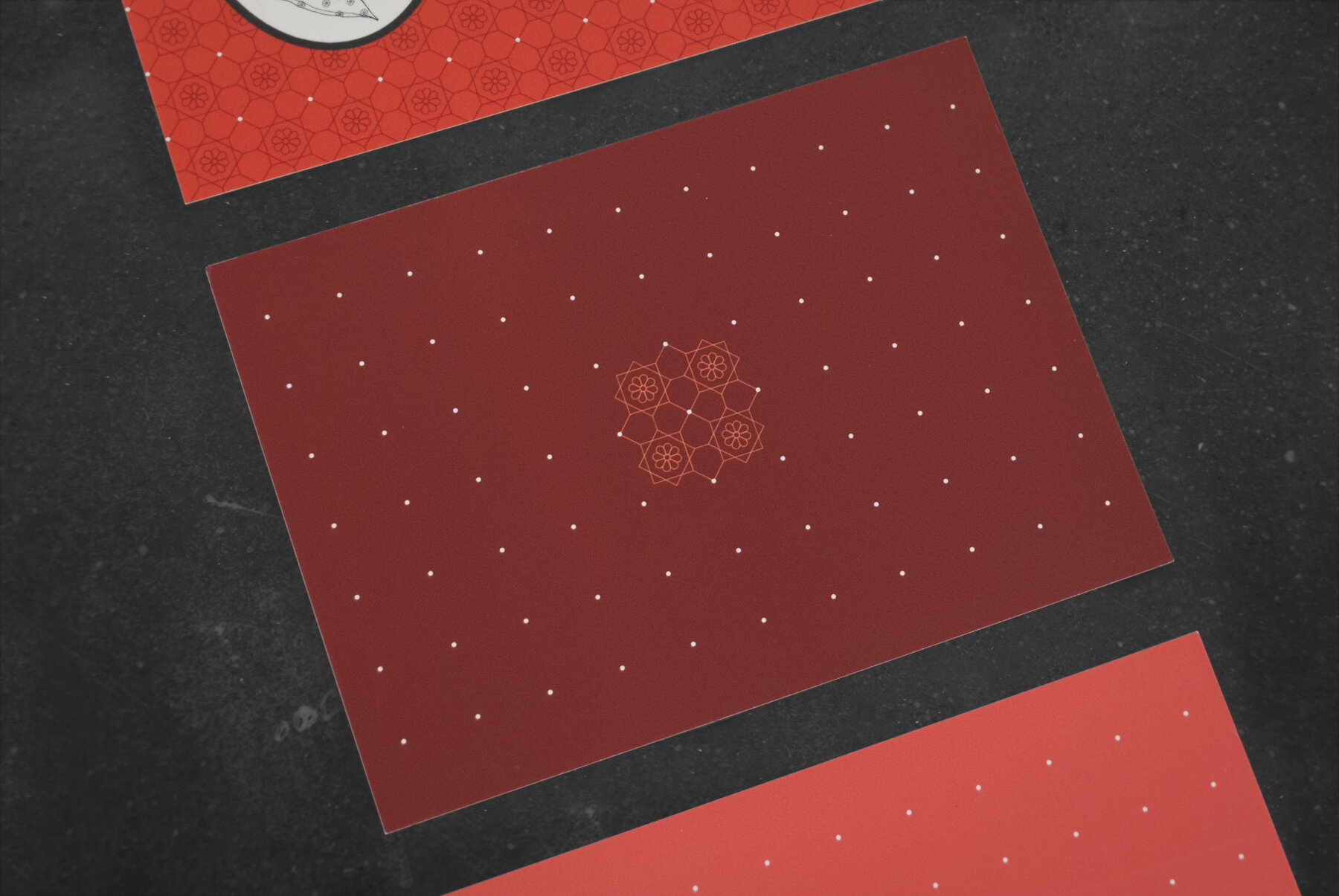
Some of my favorite pieces of design I've had the pleasure of doing in the past few years have been for wedding invites. This is not a common opinion of most designers, but it is when you have clients willing to forego the conservative calligraphy of standard wedding invites for a more unique typographic approach and bold color choices. A few favorites:
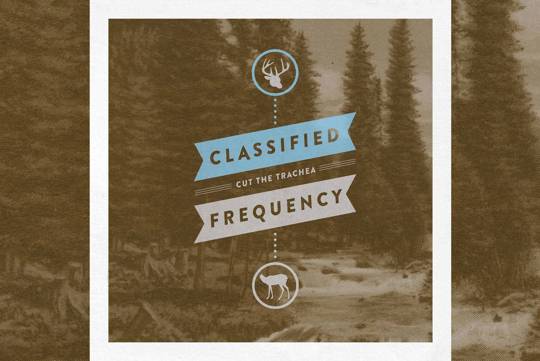
CLASSIFIED FREQUENCY
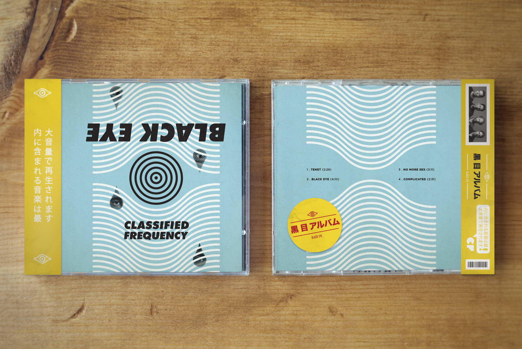
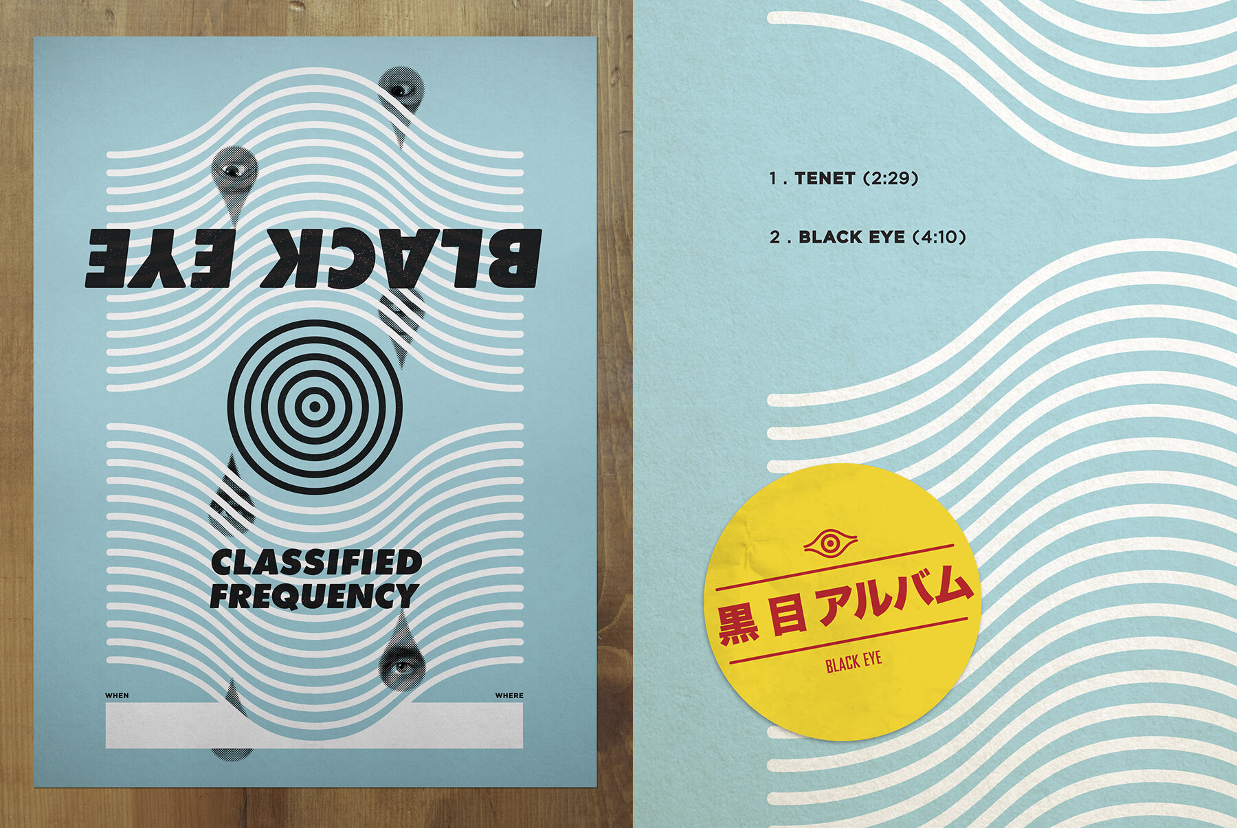
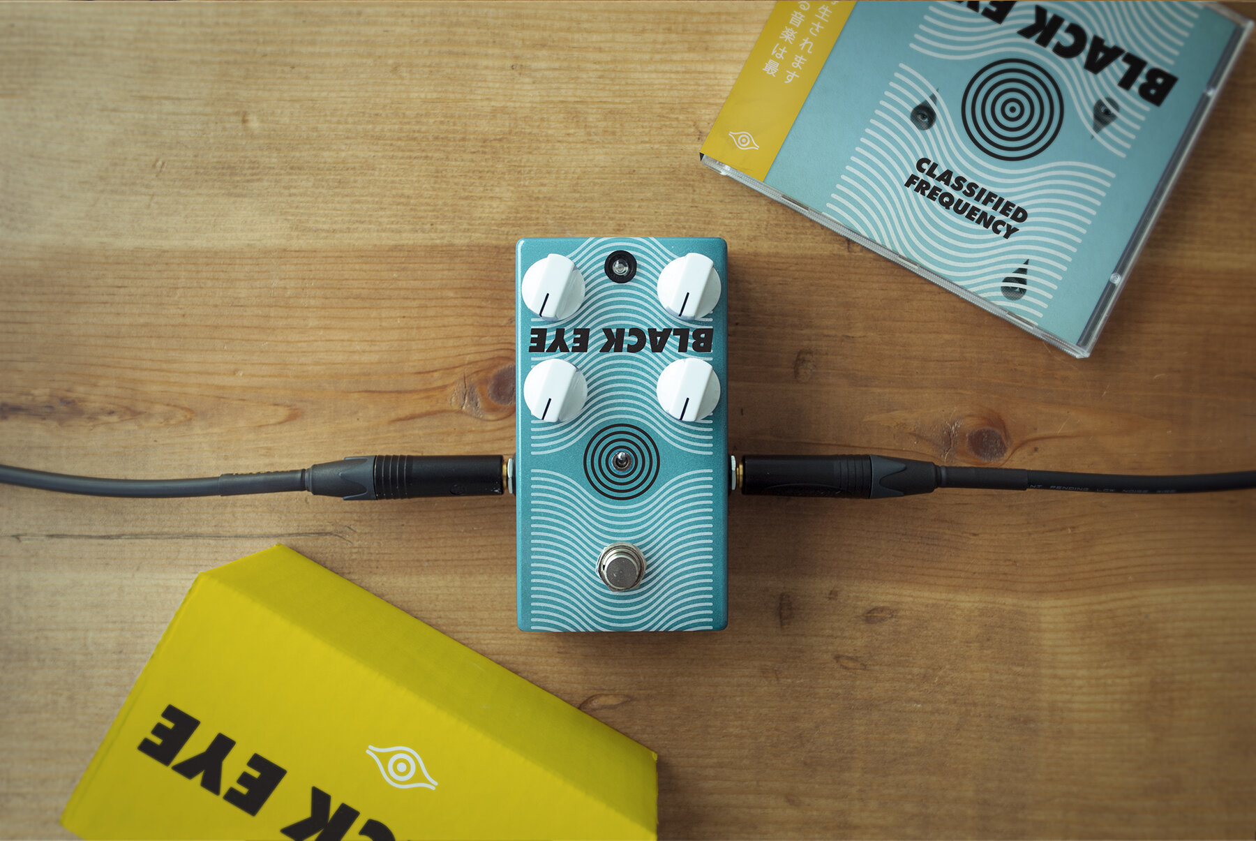
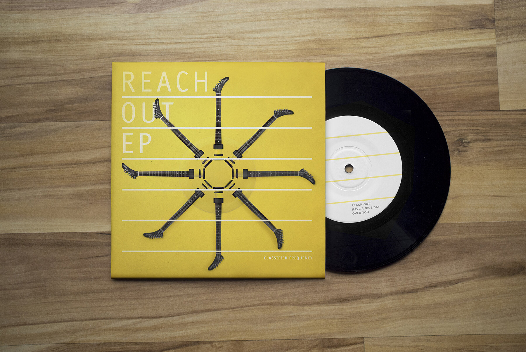
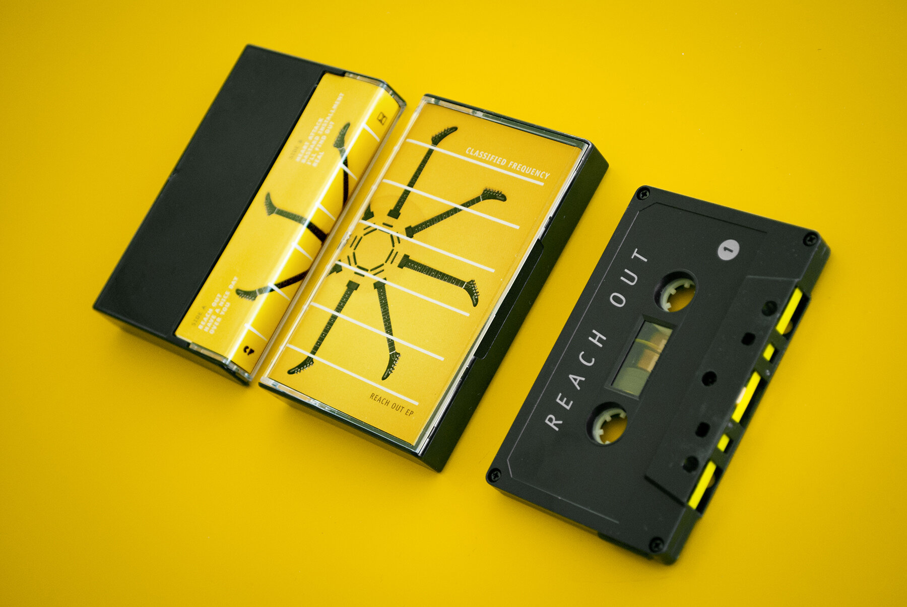
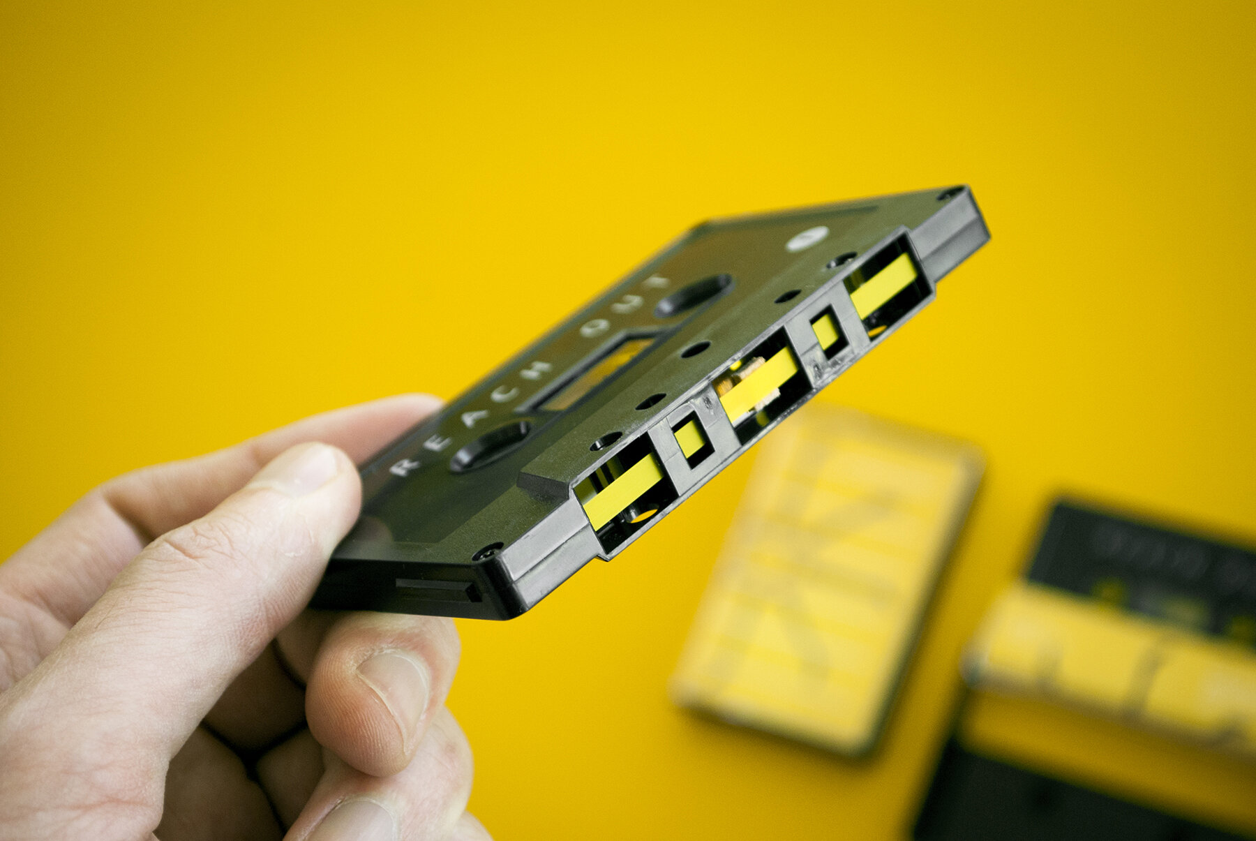
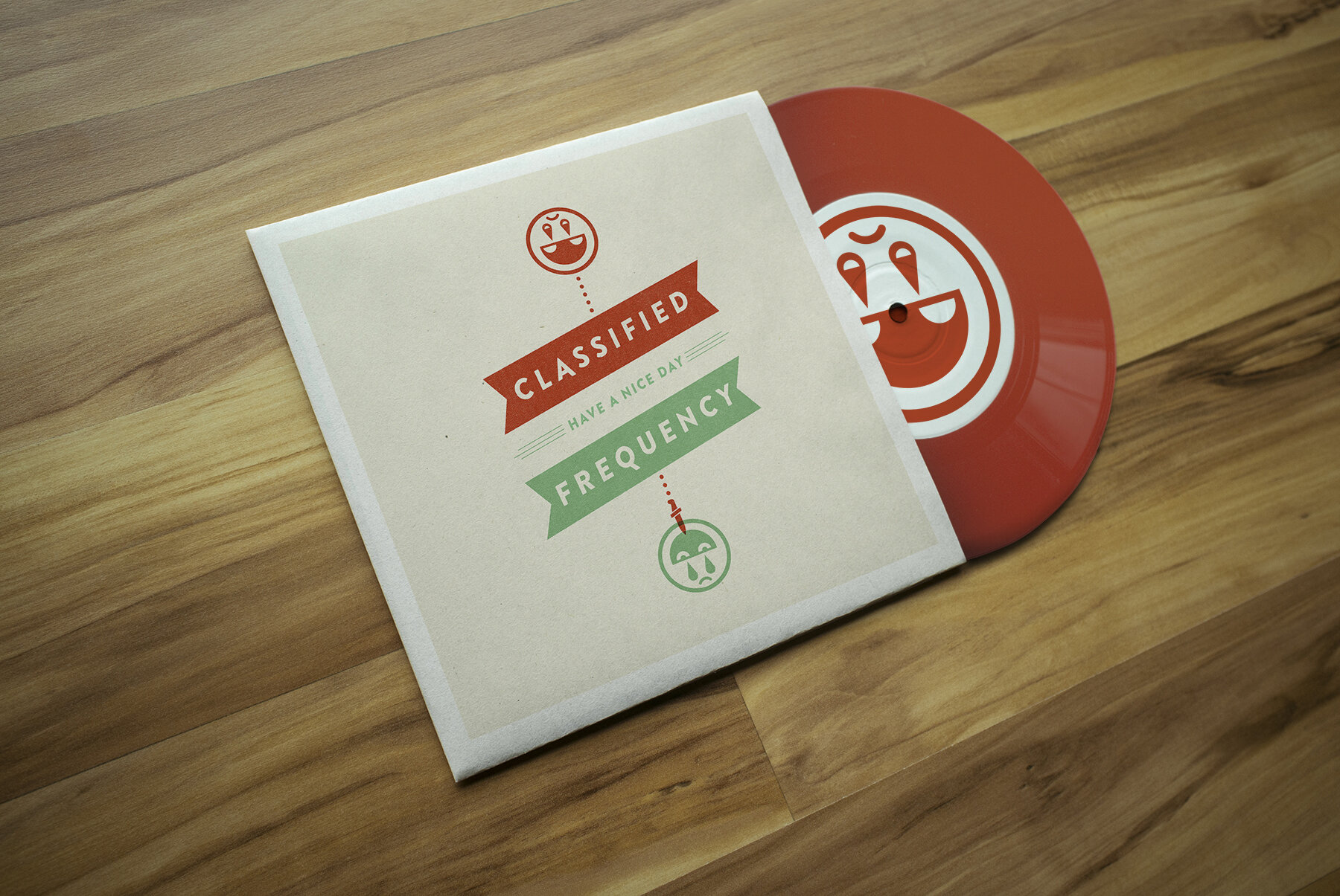
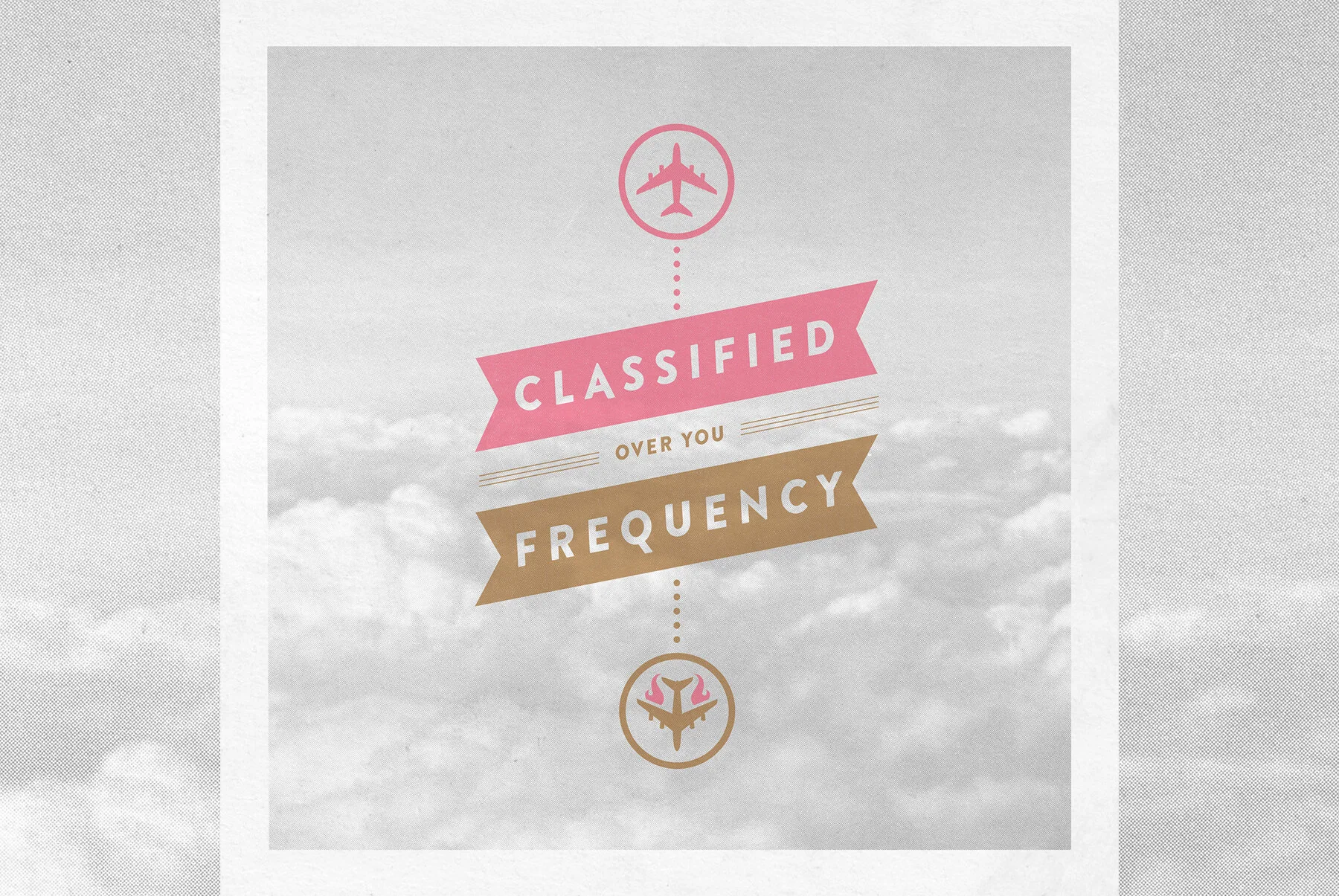
I've had the opportunity to design marks and packaging for several independent bands over the years. In my mind, each should be a unified graphic style to apply to album covers, singles, and everything sold at gigs. These are a couple of my favorite materials created for Washington DC-based power-pop outfit, Classified Frequency. Featured below is their 2018 Black Eye EP, 2015's Reach Out EP cassette release, and covers and promotional video from various singles.
Agency: Freelance, Minneapolis
Client: Classified Frequency

