...
Manitoba Harvest
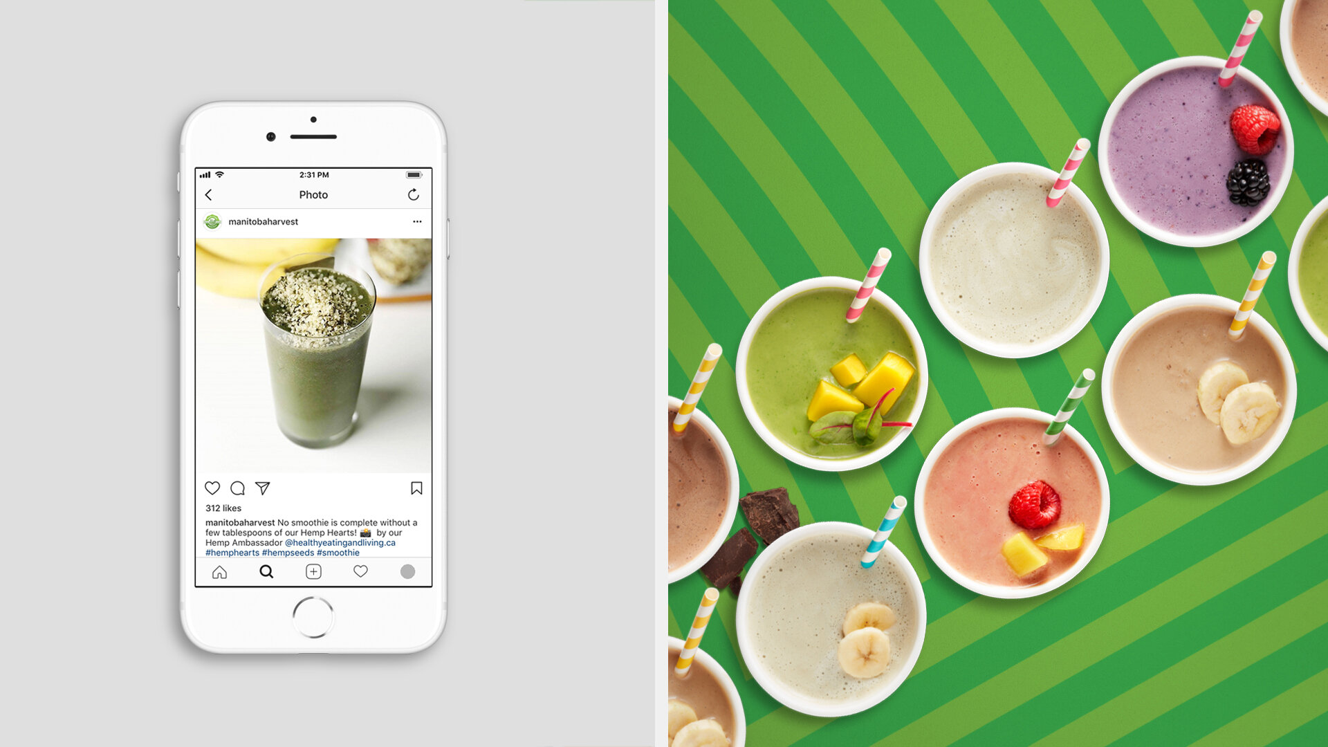
In the world of superfoods, the packaging is … not so super. Shelf after shelf of beige-colored, “earthy” products with stock photos of smiling people in yoga positions.
So we decided to turn up the energy, the color, the boldness, and the fun. Then we added an exclamation point.
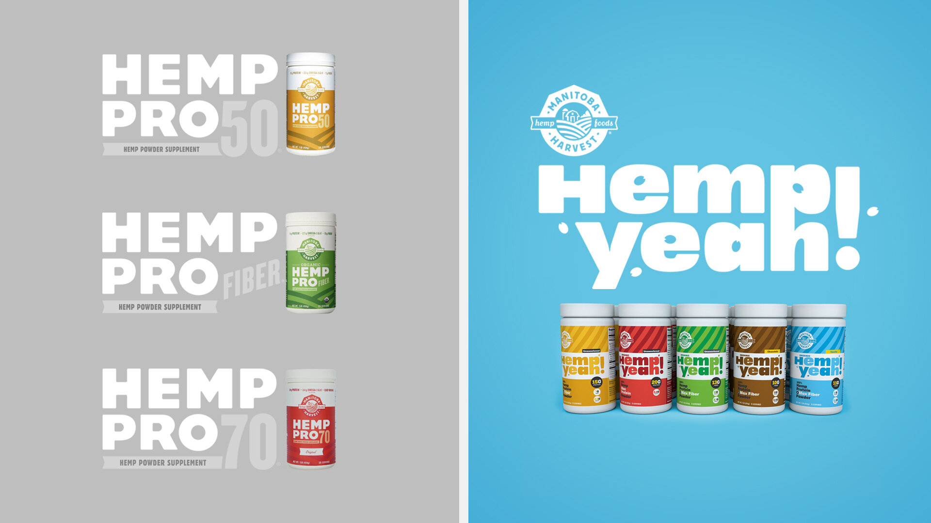
We took all of the various Manitoba Harvest hemp SKU’s and put them all under one memorable name -- Hemp Yeah! A super positive declaration of super hempy enthusiasm.
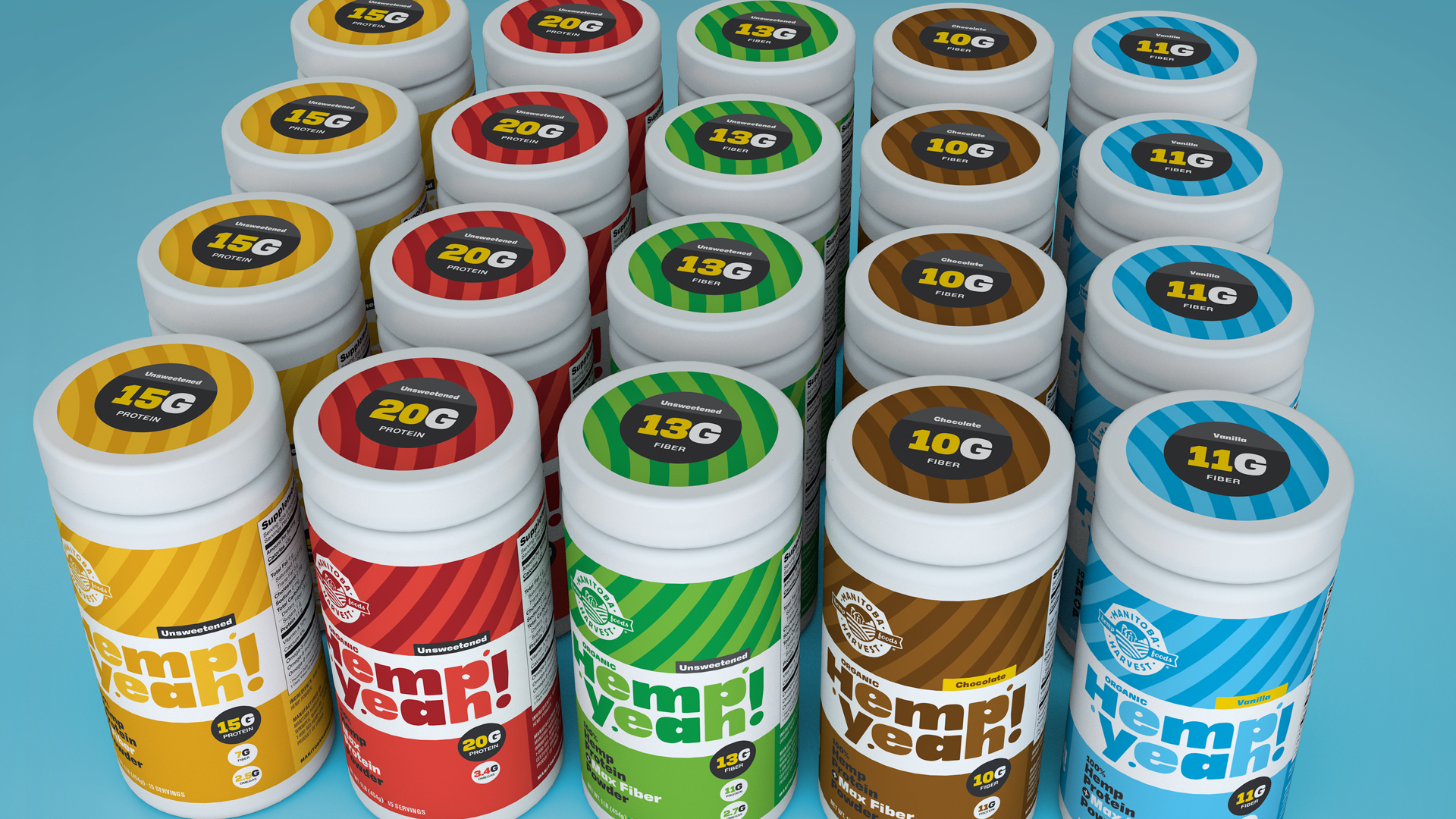
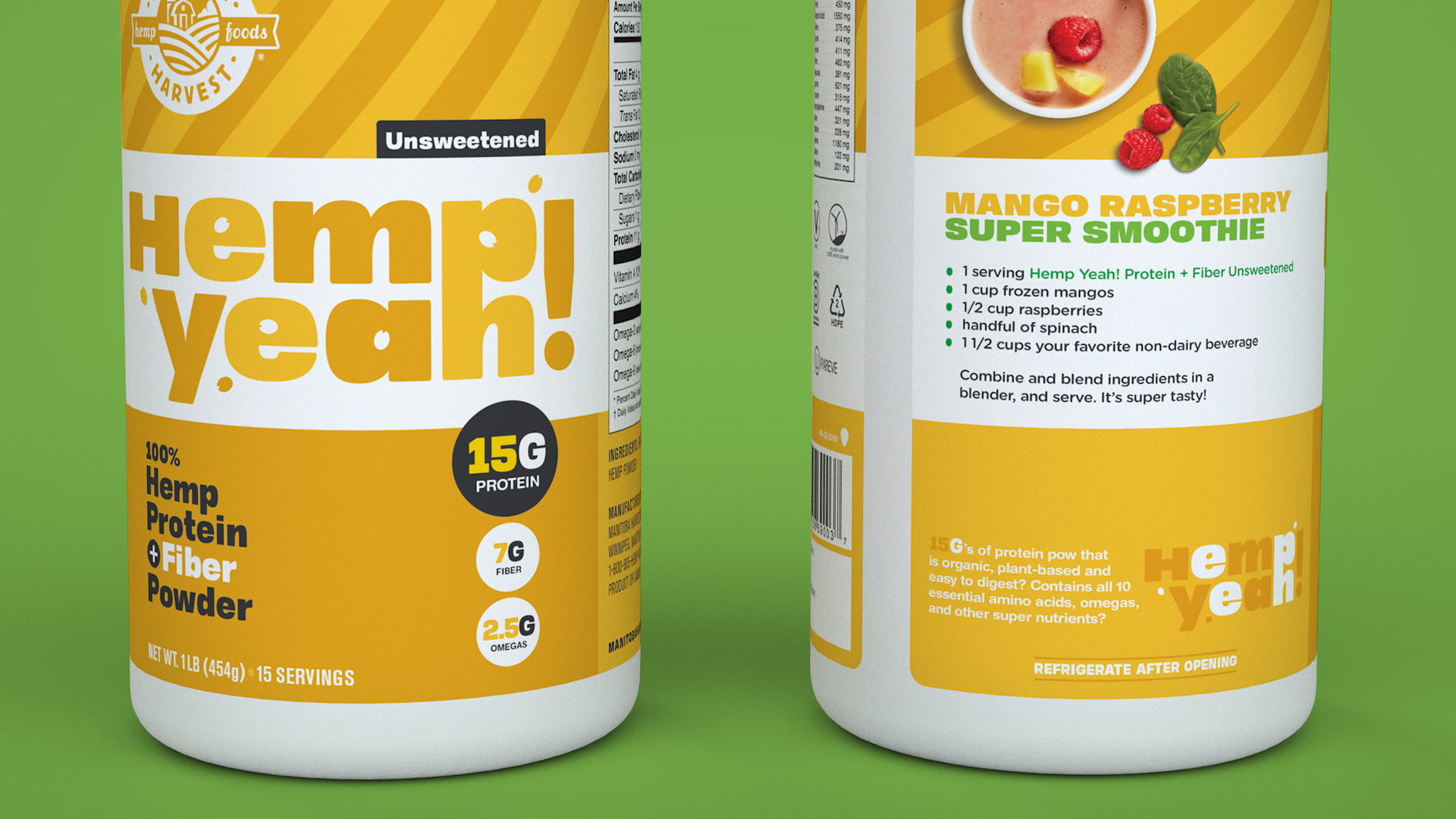
Since most people assume hemp is going to be healthy -- it is in the health food aisle after all -- we thought it was more important to amp up hemp’s taste appeal, with candy-colored packaging that reflects the different flavors.
Lined up in formation, the new packages read like a bold, colorful billboard you’d never miss in the top-to-bottom bland of a health food aisle.
LOGOMARK & PATTERNS –

PACKAGING FAMILY –

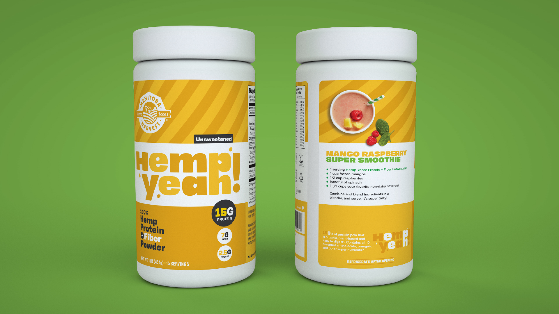
DETAILS & SMOOTHIE RECIPES –
RETHINKING NAMING & PHOTOGRAPHY –
Below are a few side-by-side examples that highlight our shift in Manitoba Harvest's branding. We took a number of different supplements with confusing names like 50 and 70 and put them under the umbrella of the Hemp Yeah! brand name. Then we changed the approach to food photography and styling by moving away from naturally-lit white kitchen counters to energetic patterns and pop colors.